

The Challenge
The founders needed to visually evolve their growing business to match their sophisticated standard of care. Their existing brand felt overly clinical and provider-centric. It failed to capture their core philosophy: that aesthetic medicine shouldn’t be about chasing an artificial transformation, but rather providing an empathetic, inclusive space to restore what is already there. They needed a brand that could establish them as an aesthetic authority in the Southeast.
Our Solution
We provided a complete strategic brand foundation that shifted the focus from clinical to artistic, bringing their “Medicine as Art” value to life:
- A Clear Strategic Foundation: We defined Arvé’s brand from the inside out—articulating a distinct positioning as a physician-led aesthetic sanctuary where medicine meets art. Through a comprehensive brand strategy (story, manifesto, positioning, values, and messaging), we established a cohesive voice and vision that guides every touchpoint, from patient experience to visual expression.
- A Meaningful New Name: We rebranded the practice as arvé aesthetics. Born from the concepts of reverie, revival, art, and vérité (truth), the name encapsulates their belief that beauty is about coming home to oneself.
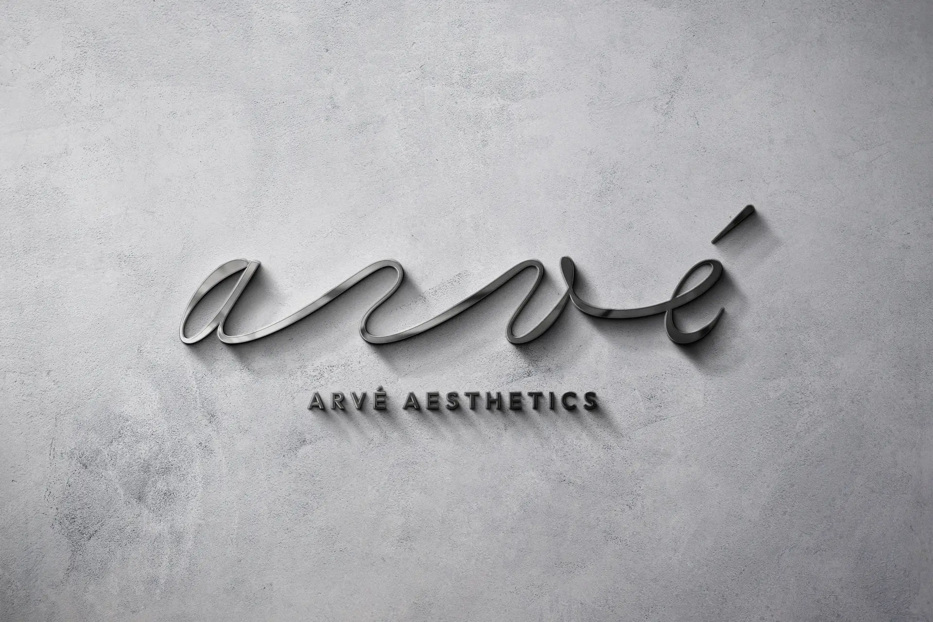
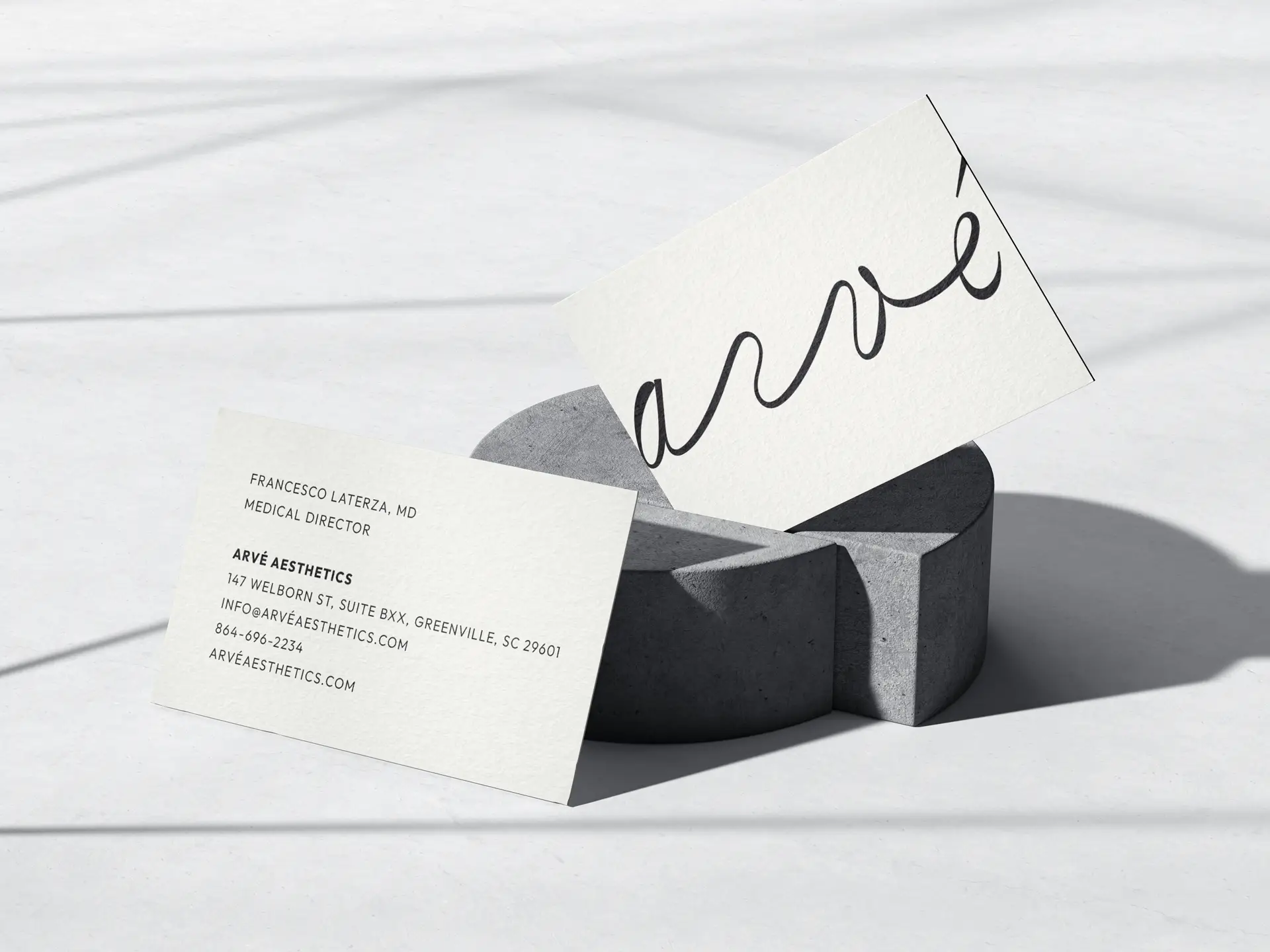
- An Artistic Visual Identity: We built a warm, minimalist visual language anchored in a tactile palette of canvas and ink. The new logo is organic and gestural—like a continuous brushstroke—carrying an approachable, beautifully imperfect sense of luxury.
- Elevated Typography: We paired Bodoni Moda, a high-contrast serif conveying digital-age elegance, with Outfit, a clean and friendly geometric sans-serif, to balance medical authority with modern warmth.
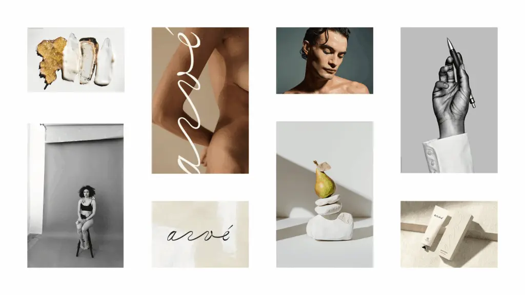
- Renaissance-Inspired Imagery: We employed dramatic, studio-lit photography reminiscent of classical sculpture to celebrate a diverse set of muses, reinforcing their “Every Body Welcome” value. Clinical details were styled to mimic fine art media, such as squeezed paints or hand-held tools, bridging the gap between medical precision and creative expression.
The Results
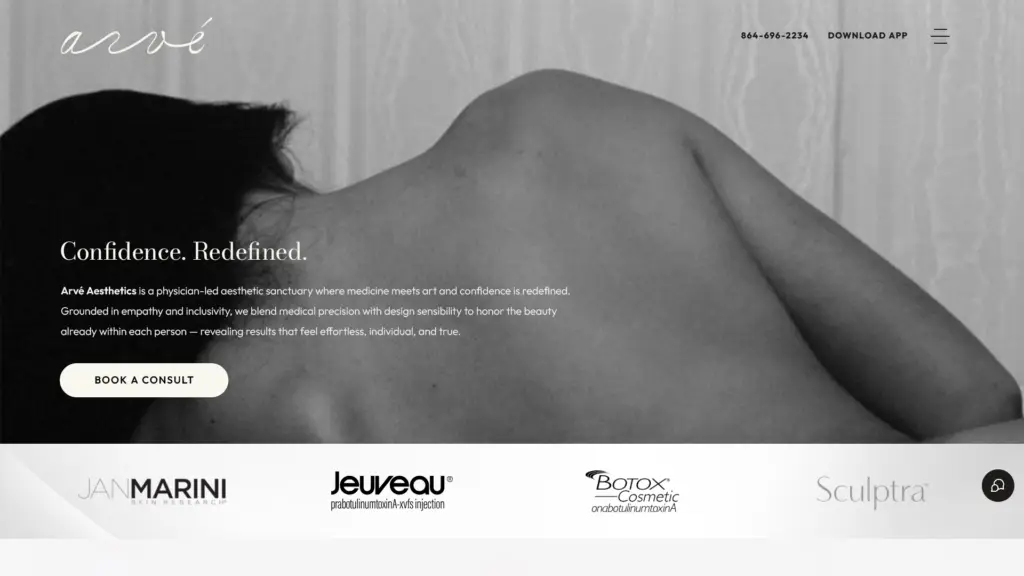
The complete transformation successfully shifted the business away from a standard clinical model to a sophisticated, lifestyle-driven destination. The new identity reflects the founders’ vision of a modern sanctuary,” and delivers on their new brand promise: Confidence. Redefined. The inclusive, highly modern identity reflects the founders’ vision, and positions them as true leaders in the aesthetic medicine space.
Testimonial
“[I] love the feel of the website. It is much more streamlined that the current one and feels clean. It reminded me of what I would expect for a website from Chick-fil-A or Apple. The depth and quality of content overall is spectacular. Overall, I’m very excited by what you and the team have put together there and think it is a huge improvement for us.”
— Preconstruction Manager | J Davis Construction