
The Challenge
For their 2026-2027 season, The Warehouse Theatre needed a new look and feel that unified six distinct productions. The typography had to be modern and boundary-pushing while remaining legible for audience members, and the artwork had to be impactful enough that large posters could be read by passing cars. The client requested a message-forward approach that leaned into the unexpected, fun show summaries that audiences responded so well to in previous seasons.
Our Solution
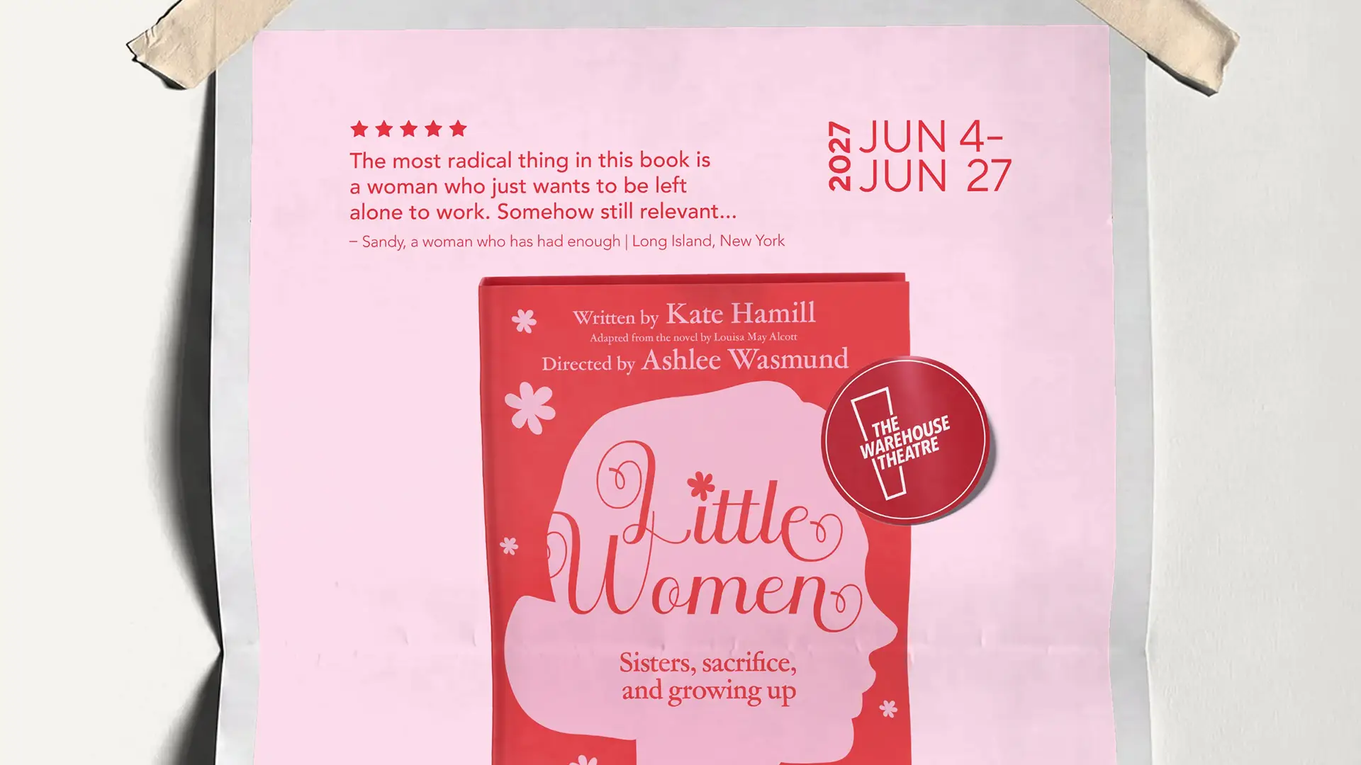
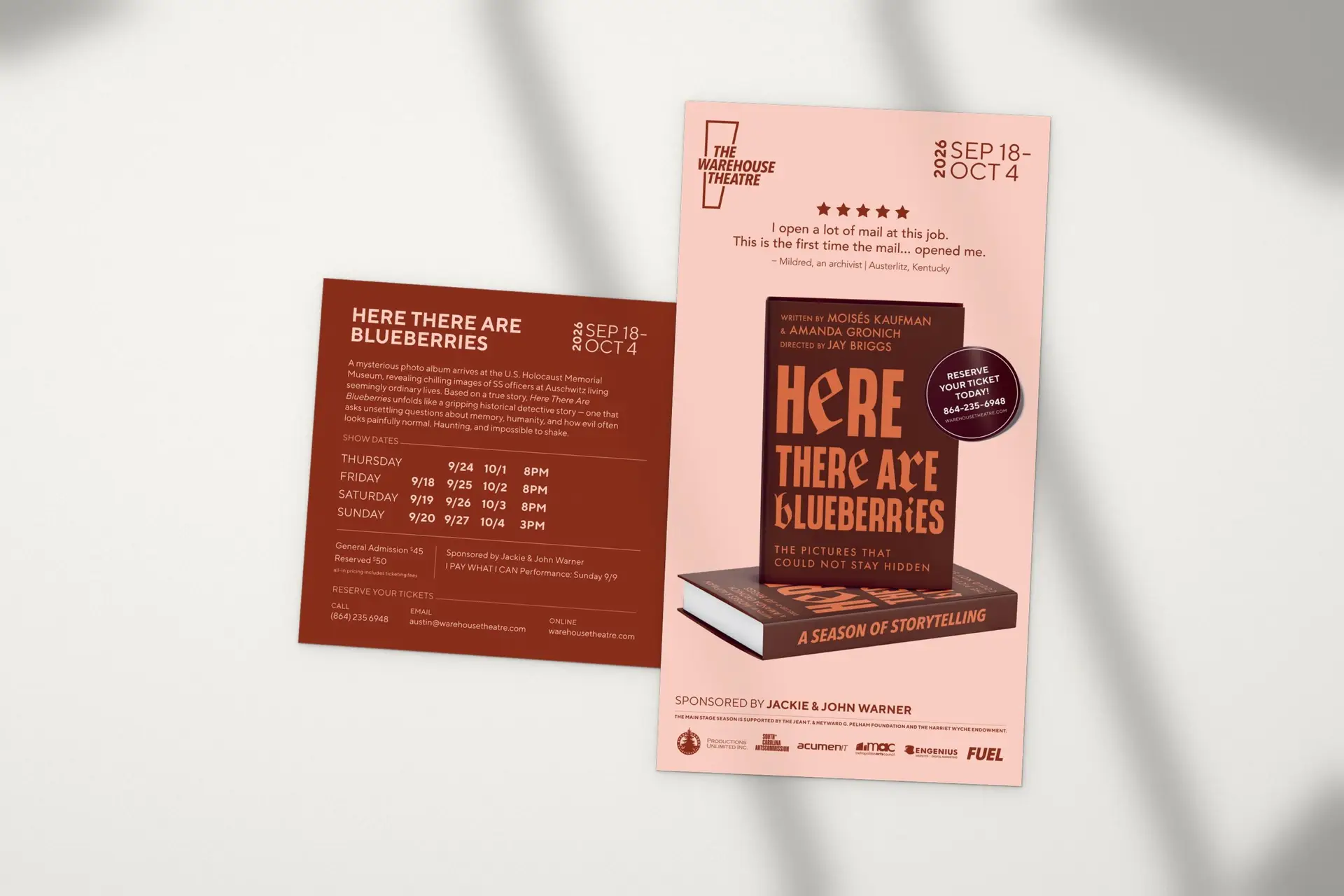
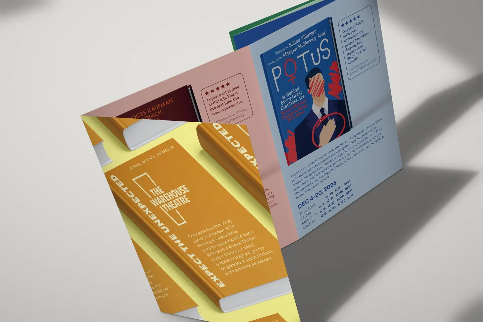
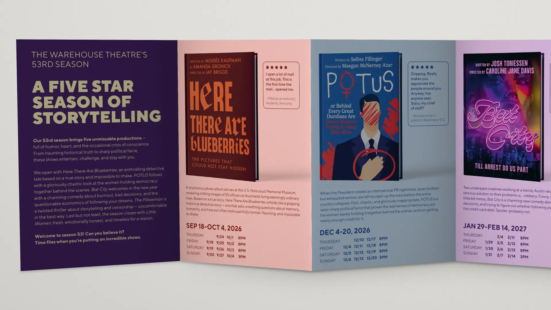
To meet the need for a message-forward, cohesive campaign, we developed a visual system inspired by literary bestsellers. We treated each of the six plays as a “hit novel,” leaning heavily into copywriting that builds intrigue without spoiling the plot.
The Bestseller Concept: The poster series showcases each show as a book, complete with reviews that highlight the things that were loved, hated, or misunderstood in the “book.” It mimics a classic bookstore “bestseller” poster you might see in a window for the latest New York Times hit.
Review-Driven Storytelling: The reviews are essentially where the concept lives. Depending on the show, they might be glowing, baffled, suspiciously specific, snarky, or absolutely devastating. This opened up a lot of comic potential and gave a lot of insight into some of the highlights and tone of the plot without revealing too much.
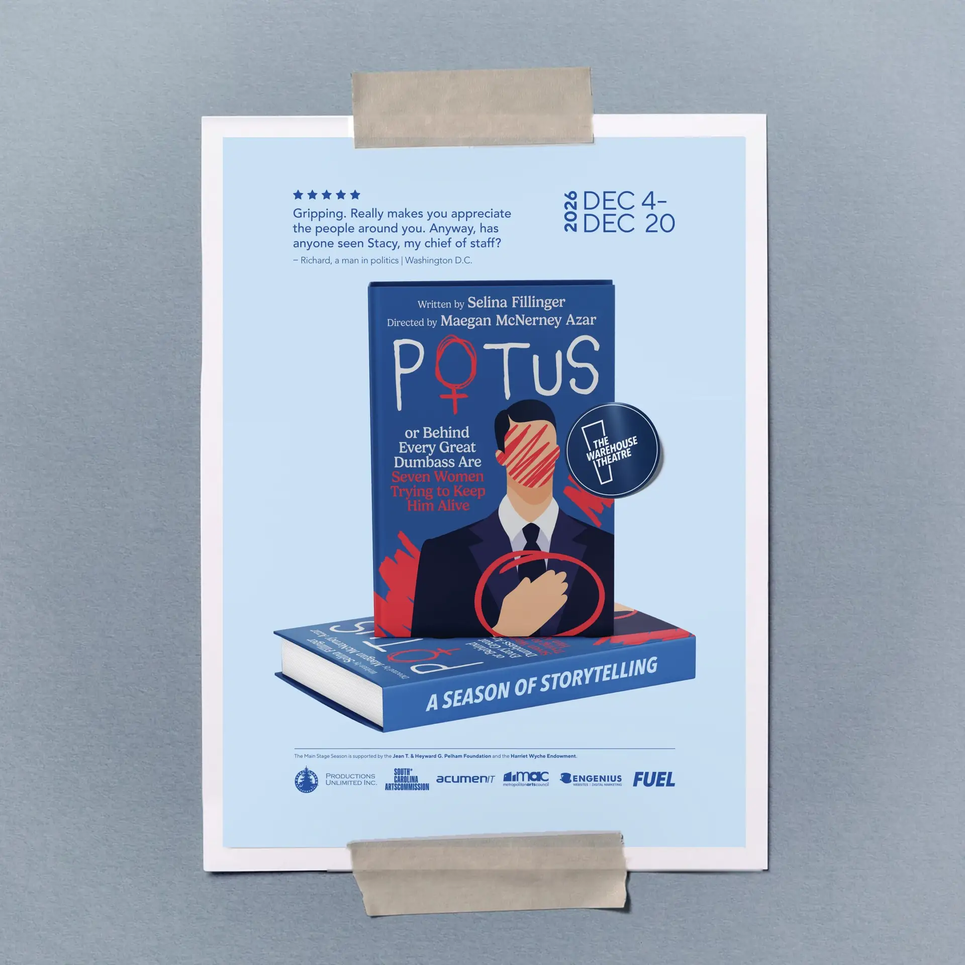
Character & World Building: Each poster pairs a book cover with a set of review blurbs—the kind that appear on back covers or magazines written by people somewhat linked to the story, or not at all, who may or may not have fully understood what they were reading.
Authentic Construction: Each poster features a custom-designed book cover, which gives more insight into the tone of the story.
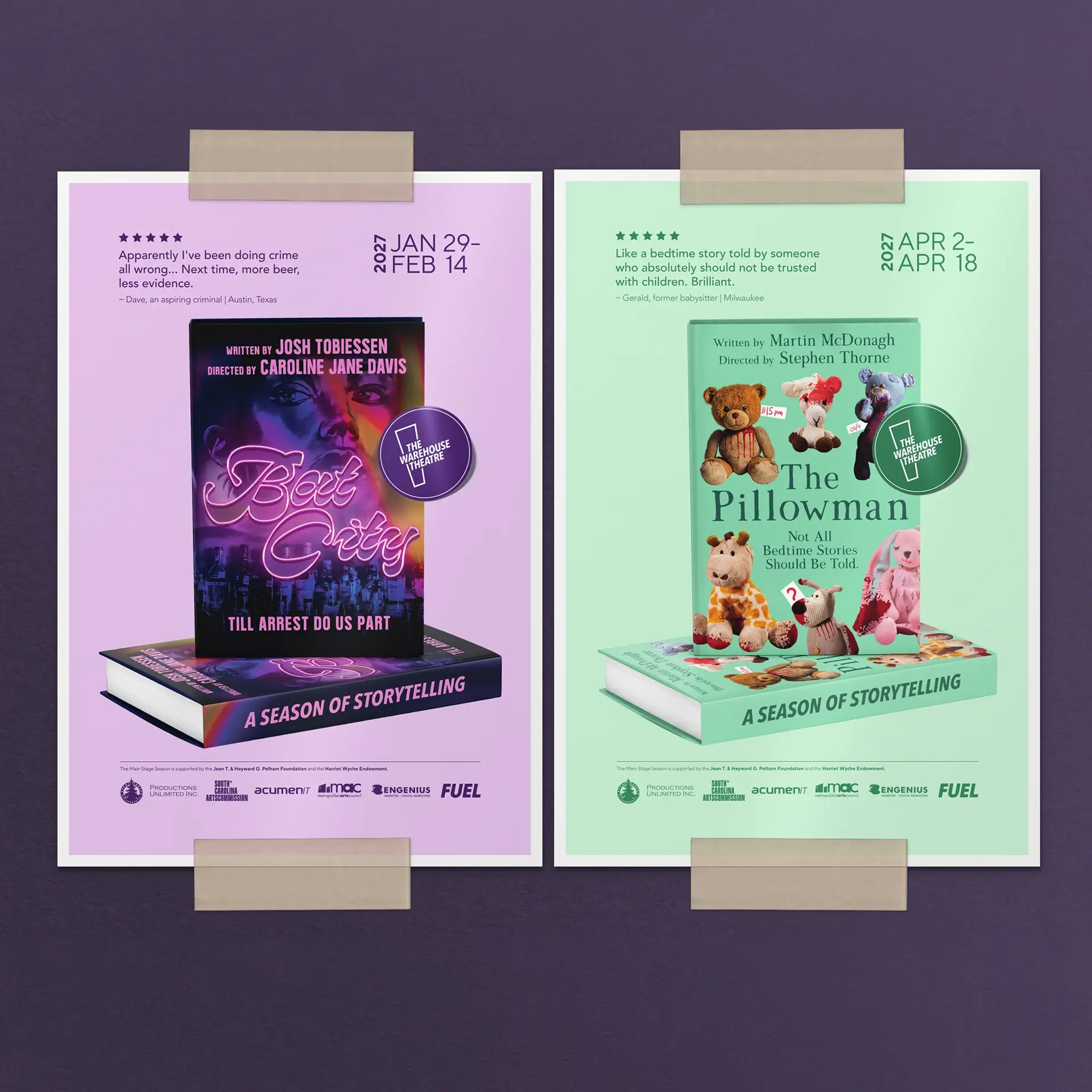
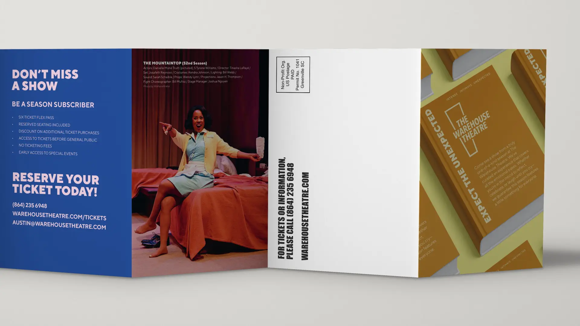
Comprehensive Rollout: This concept was seamlessly adapted across all of the season’s deliverables, including posters, posters, a season brochure, direct mail postcards, and Gala invitations.
The Results
The new look and feel successfully unified the six shows under a singular, captivating conceptual umbrella. The “bestseller” approach delivered the edgy typography and message-forward design The Warehouse Theatre desired, ensuring stopping power for passing cars while perfectly capturing the intense, intimate, and unexpected spirit of Season 53.
Testimonial
“[I] love the feel of the website. It is much more streamlined that the current one and feels clean. It reminded me of what I would expect for a website from Chick-fil-A or Apple. The depth and quality of content overall is spectacular. Overall, I’m very excited by what you and the team have put together there and think it is a huge improvement for us.”
— Preconstruction Manager | J Davis Construction