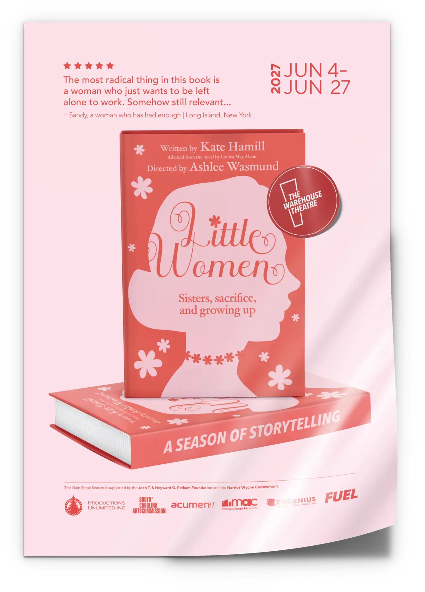
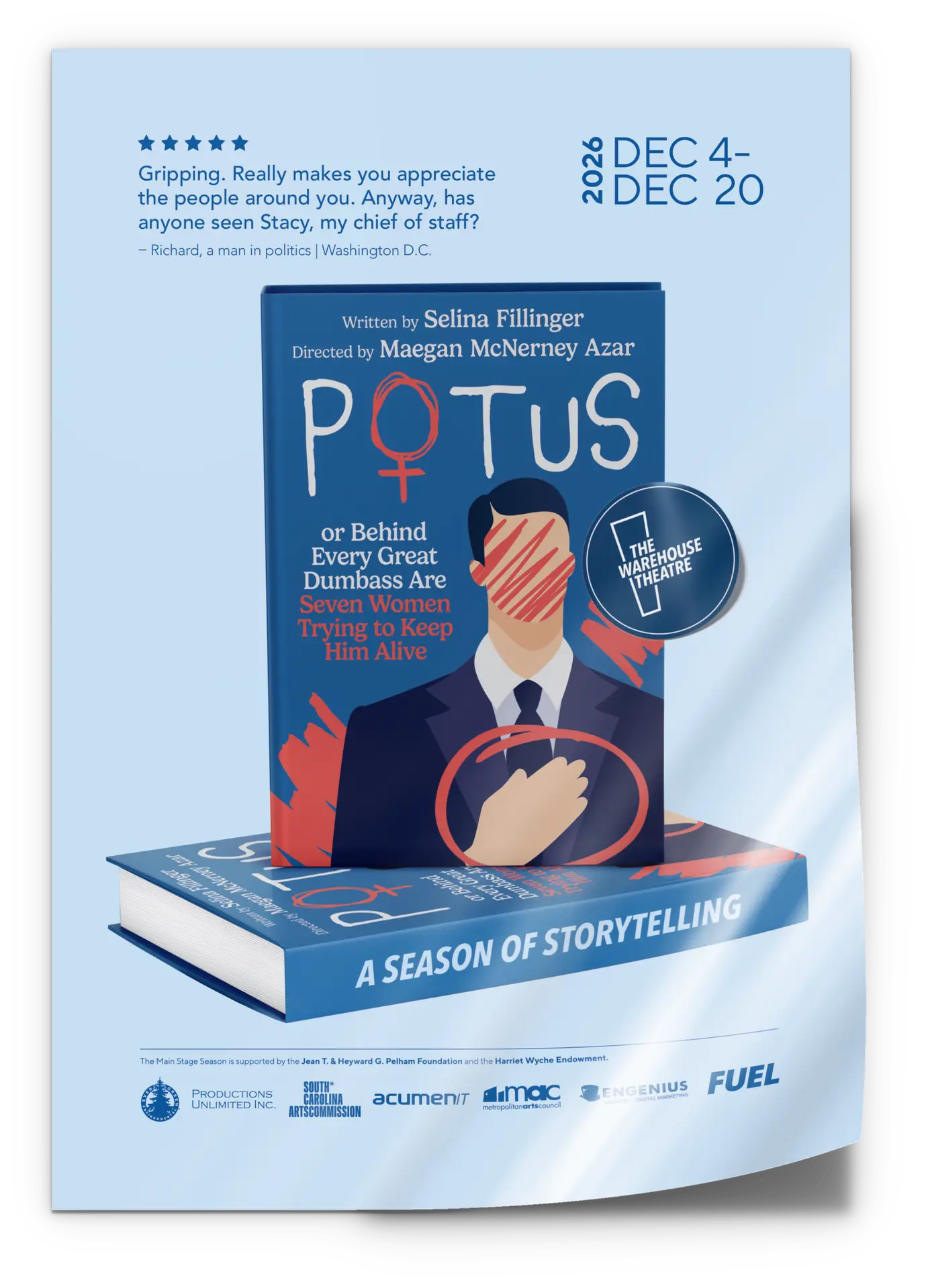
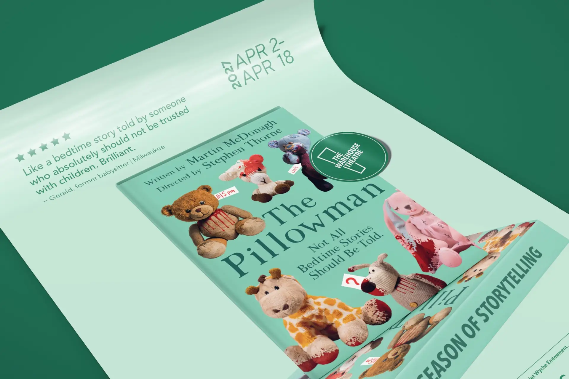
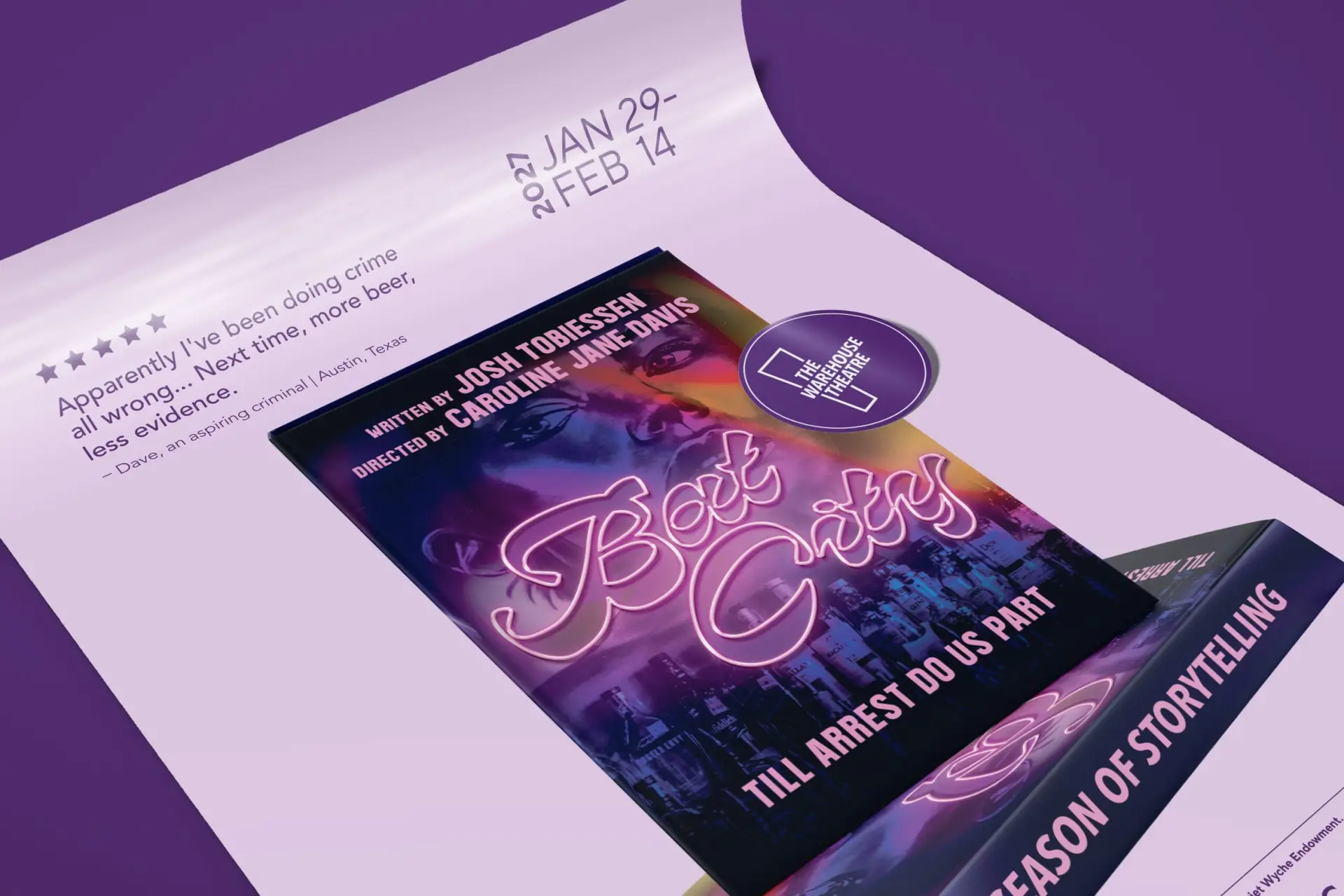
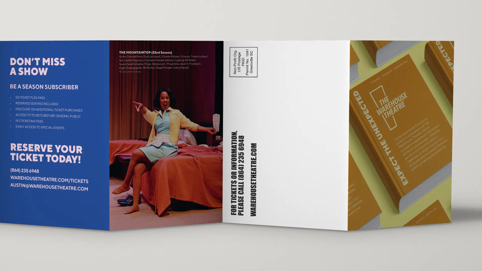
The Warehouse Theatre in Greenville, SC, is a dynamic part of the local arts scene, known for its commitment to high-quality, thought-provoking theater. Preparing for their 53rd season, they partnered with FUEL to create a new, unique, and unexpected creative campaign. The result was a highly engaging poster and collateral series that captured the unique storytelling of the upcoming season.
The Challenge
For their 2026-2027 season, The Warehouse Theatre needed a cohesive campaign to unify six distinct productions. The visual identity had to appeal to a broad demographic while remaining bold enough for large posters to double as highly visible roadside signage. Additionally, the client wanted a copy-driven approach, leveraging the witty show synopses that had successfully engaged audiences in past seasons.
Our Solution
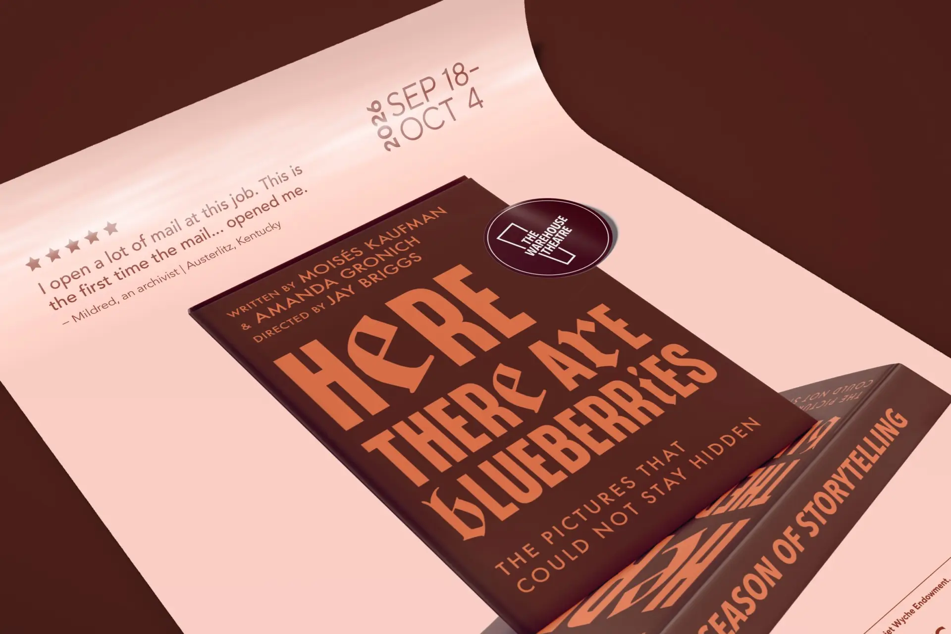
To meet the need for a message-forward campaign, we developed a visual system inspired by literary bestsellers. We treated each of the six plays as a “hit novel,” leaning heavily into copywriting that builds intrigue without spoiling the plot.
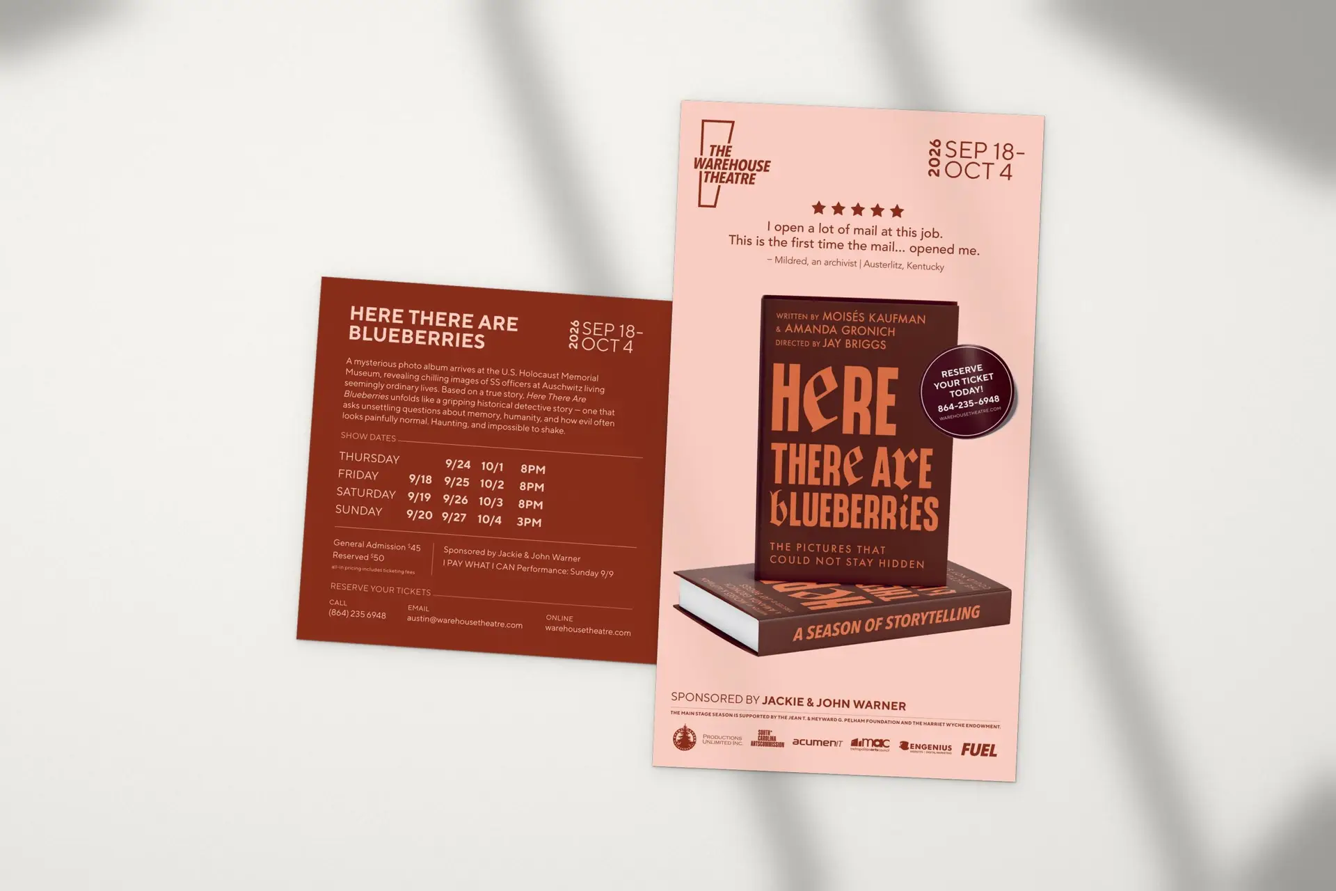
The Bestseller Concept:The poster series showcases each show as a book, complete with reviews that highlight the things that were loved, hated, or misunderstood in the “book.” It mimics a classic bookstore “bestseller” poster you might see in a window for the latest New York Times hit.
Review-Driven Storytelling: The reviews are essentially where the concept lives. Depending on the show, they might be glowing, baffled, suspiciously specific, snarky, or absolutely devastating. This opened up a lot of comic potential and gave a lot of insight into some of the highlights and tone of the plot without revealing too much.
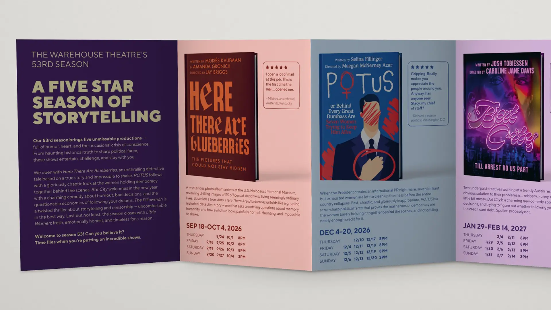
Cover Art: Each poster features a custom-designed book cover, which gives more insight into the tone of the story.
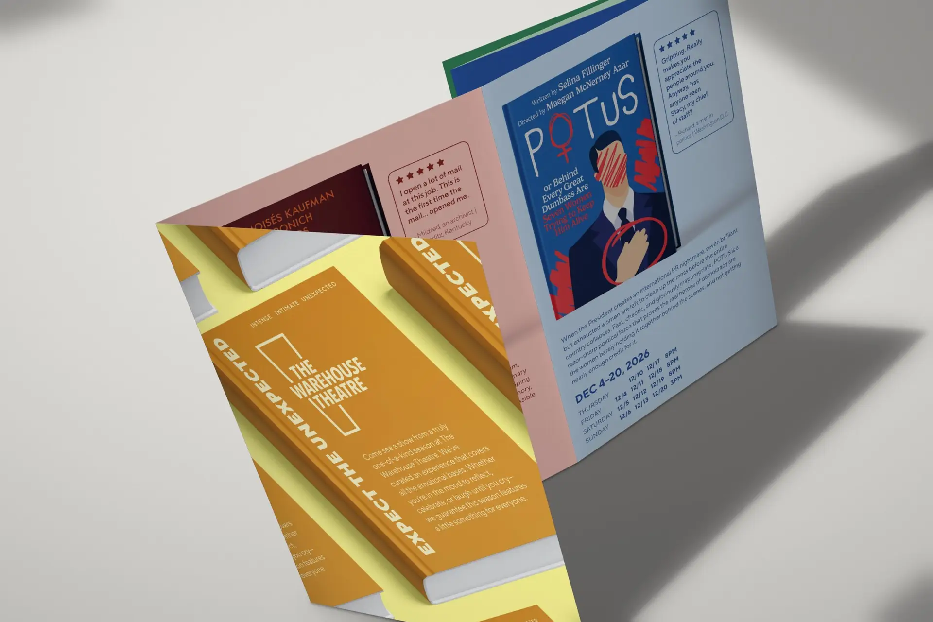
Comprehensive Rollout: This concept was seamlessly adapted across all of the season’s deliverables, including posters, a season brochure, direct mail postcards, and Gala invitations.
The Results
The new look and feel successfully unified the six shows under a singular, captivating conceptual umbrella. The “bestseller” approach delivered the unique message-forward design The Warehouse Theatre desired, ensuring stopping power for passing cars while perfectly capturing the intense, intimate, and unexpected spirit of Season 53.
Testimonial
“[I] love the feel of the website. It is much more streamlined that the current one and feels clean. It reminded me of what I would expect for a website from Chick-fil-A or Apple. The depth and quality of content overall is spectacular. Overall, I’m very excited by what you and the team have put together there and think it is a huge improvement for us.”