We transformed the South Carolina Commission of Community Advancement and Engagement with a modern, approachable brand identity, strategic framework, and memorable nickname—Advance SC. The result is an innovative, non-governmental brand presence that honors their legacy while positioning them as the state’s premier research partner for community advancement.
The Challenge
The primary challenge was to create a brand that ushered in a new chapter focused on supporting the socioeconomic development of all South Carolina citizens, while still honoring the agency’s history.
Specifically, the agency needed a strategic rebrand to overcome the following hurdles:
Improving public understanding: Their existing brand and messaging were unclear, making it difficult for the general public to easily understand who the agency is and what they actually do.
Reflecting updated legislative duties: The new identity had to align with their amended focus of supporting rural and under-resourced communities.
Increasing legibility & approachability: A lengthy, cumbersome agency acronym (SCCCAE) and a complex, hard-to-read logo projected a bureaucratic tone, creating a visual barrier for an organization that needed to feel welcoming and accessible to everyday residents.
Our Solution
Brand Strategy Approach Highlights
Strategic “Bridging” Framework We developed a messaging foundation based on the concepts of “Othering and Belonging,” establishing Advance SC’s role as a bridge that tackles systemic divides through empathy, engagement, and co-creation.
Co-Creation as Brand DNA The strategy positions the agency’s differentiator as “co-creation”—working directly with both underserved communities to build data narratives and with policymakers to build new, inclusive systems.
Data-Driven Positioning We defined Advance SC as the state’s essential connector and leading research partner, translating community stories into actionable insights that maximize economic opportunity for all South Carolinians.
Dual-Audience Key Messaging We created tailored messaging frameworks that position the agency as a supportive guide and advocate for communities, while simultaneously pitching them to policymakers as essential, ROI-driving infrastructure for targeted policy solutions.
Brand Design Approach Highlights
Memorable Naming – Created a nickname to increase memorability and approachability and signal a commitment to progress, positive change, and proactivity.
Meaningful Logo Design – Developed a logomark that symbolizes the bridging strategic framework, upward momentum and reaching across divides to connect communities.
Purposeful Color Palette – Utilized Indigo Blue as the primary brand color, shared with the South Carolina state flag, to represent the state’s rich history and the agency’s steadfast commitment.
Approachable Aesthetic – Crafted a dynamic visual identity that breaks away from traditional bureaucratic design, signaling that the agency is open and accessible to everyone.
Logo Meaning
The Upward Triangle / Represents advancement and upward movement for rural and under-resourced communities.
The Arch / Represents bridging the gaps, reaching across divides, and connecting communities.
Indigo Blue / Our primary color is Indigo Blue, shared with the South Carolina state flag, representing our rich history and commitment to our state.
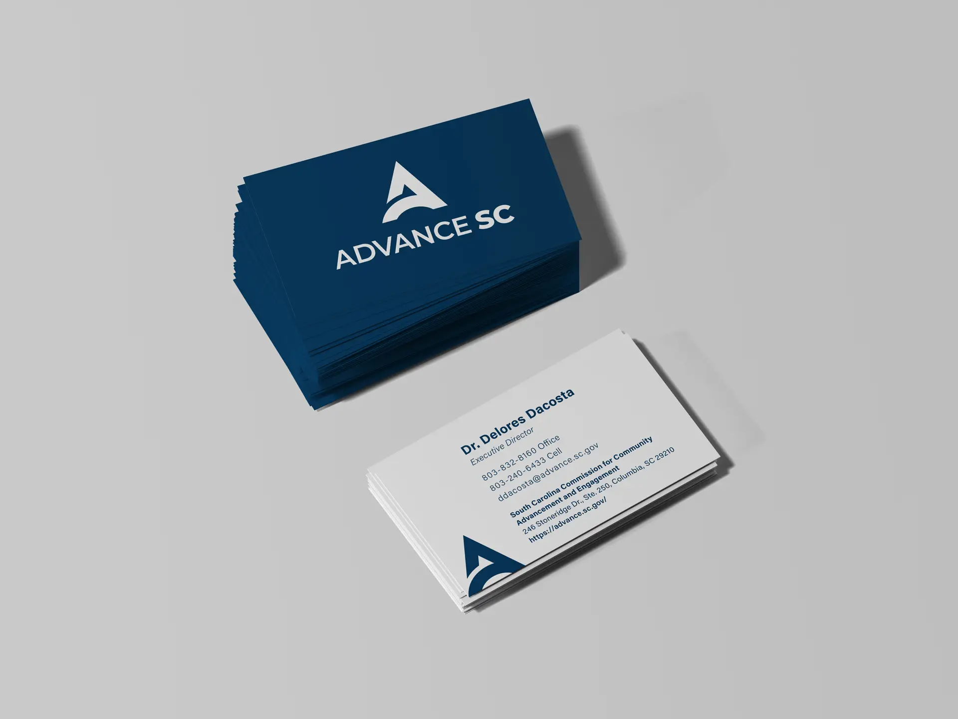
Stationery
Signage
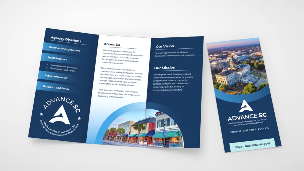
Collateral Design
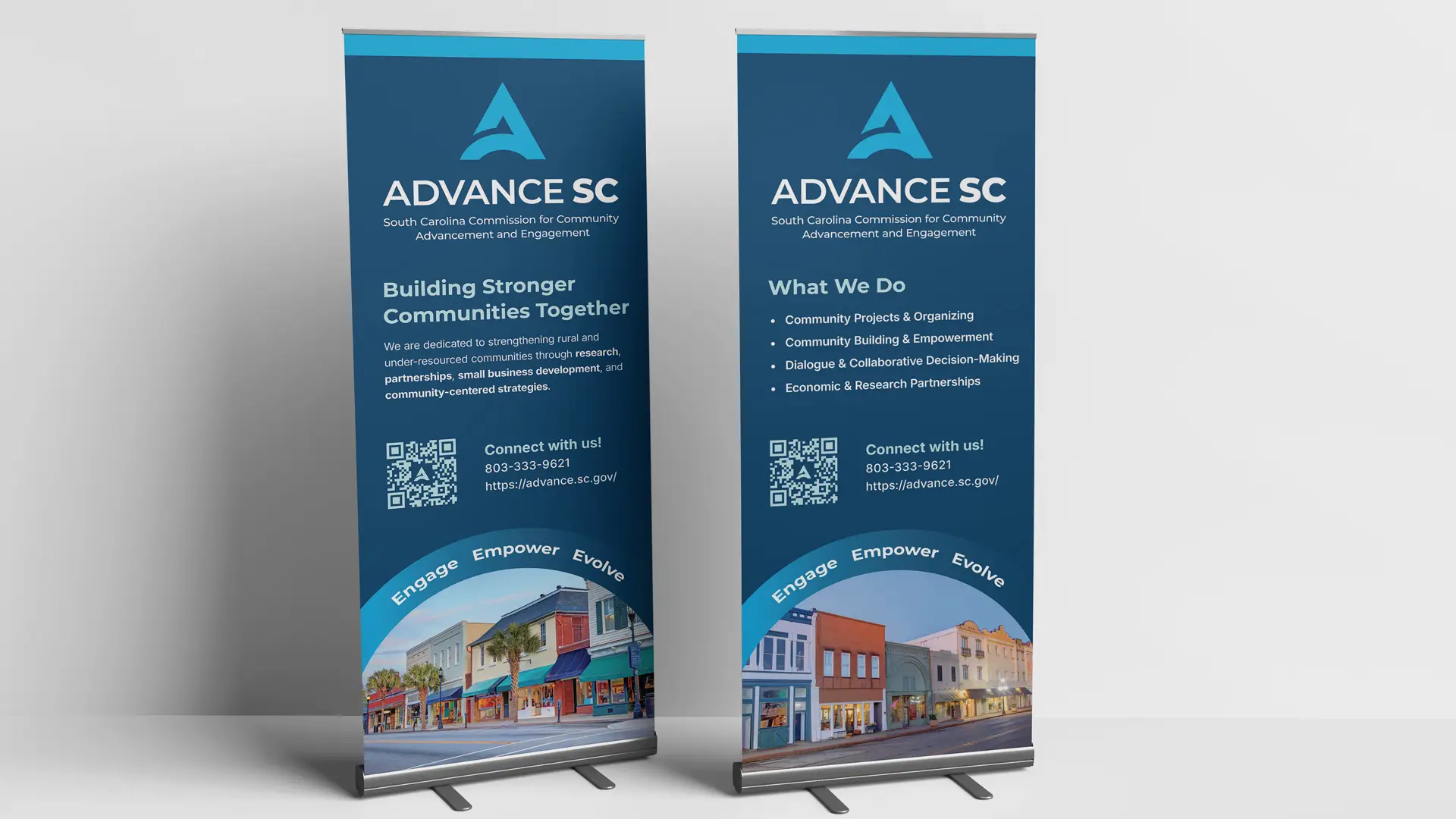
Event Signage: Retractable Banners
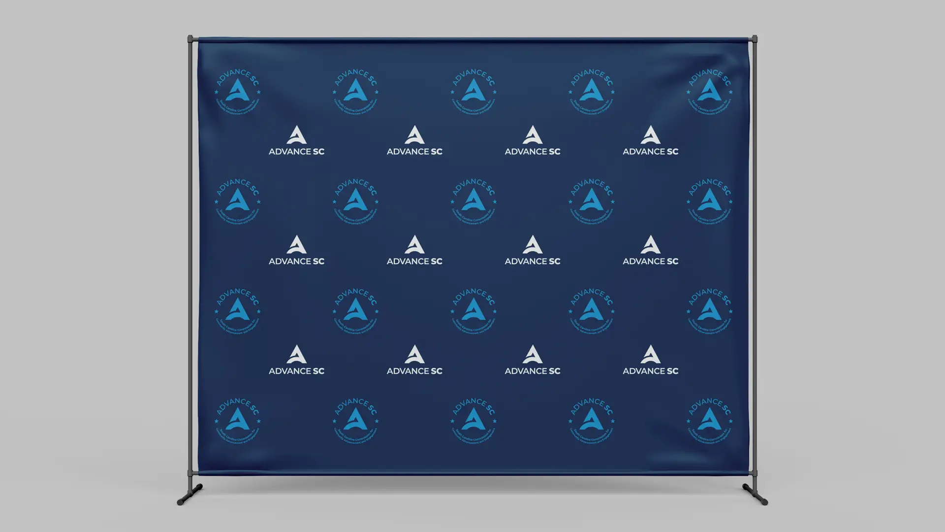
Event Signage: Step & Repeat
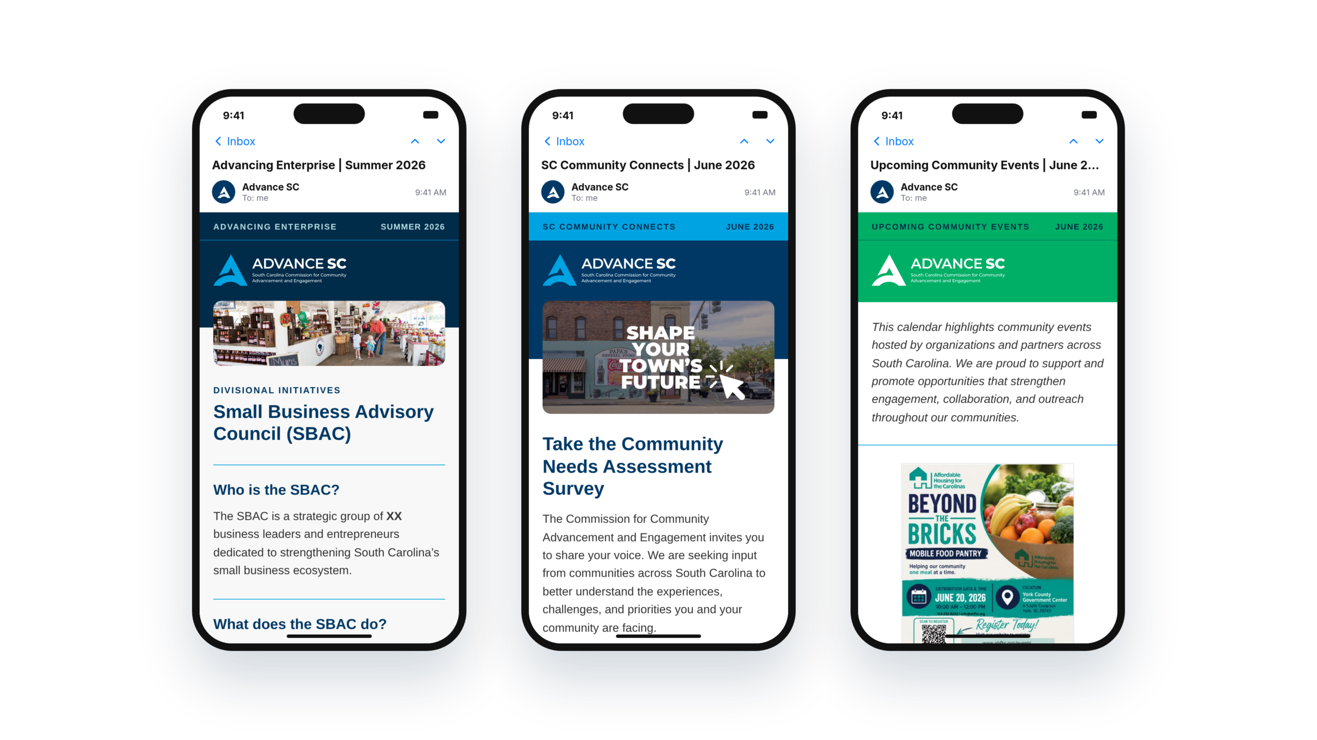
Email Design
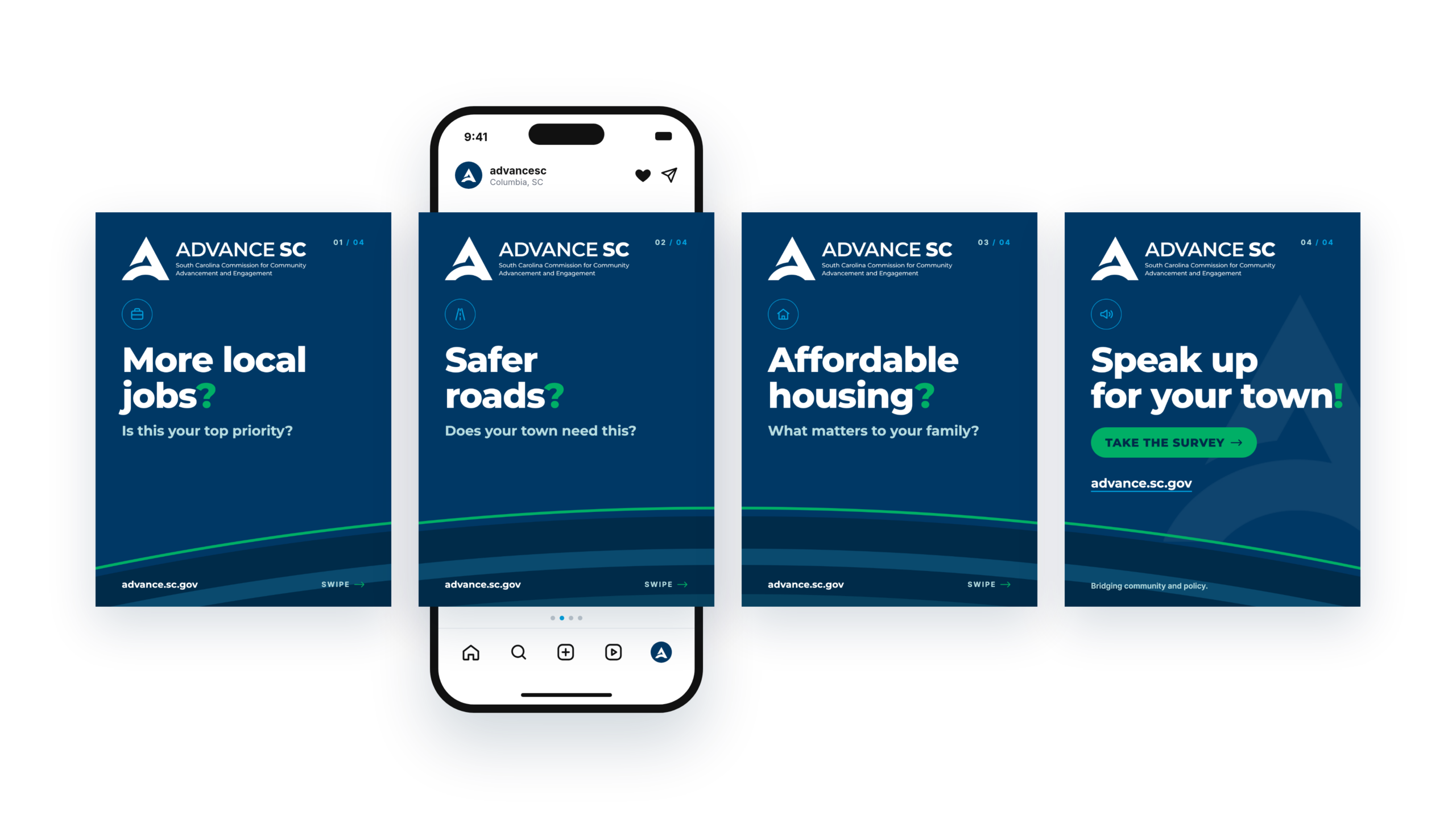
Campaign Development
The Results
The new brand identity now:
Encourages community acceptance through a fresh, non-governmental look and feel
Improves overall brand legibility, consistency, and name recognition
Reflects an innovative, future-forward ideology that honors their historical legacy
This brand evolution doesn’t just look modern — it actively works to bridge gaps, connect communities, and drive South Carolina forward.