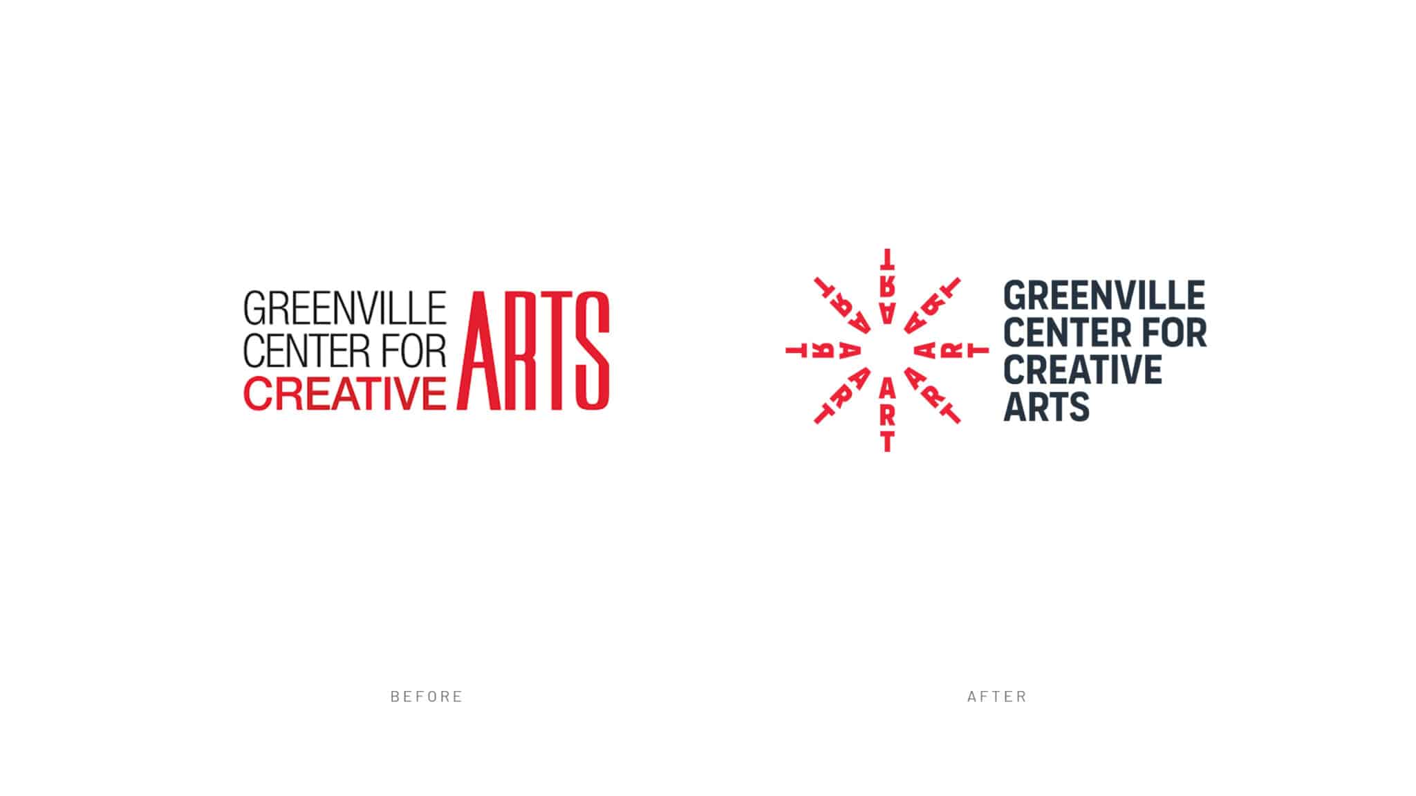
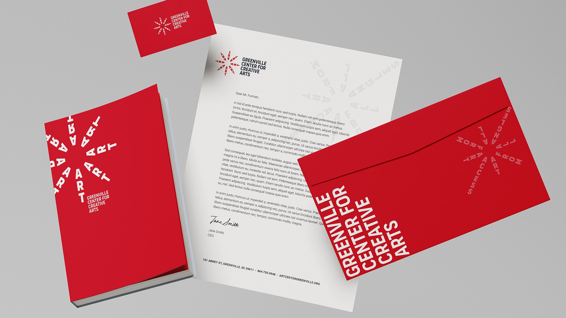
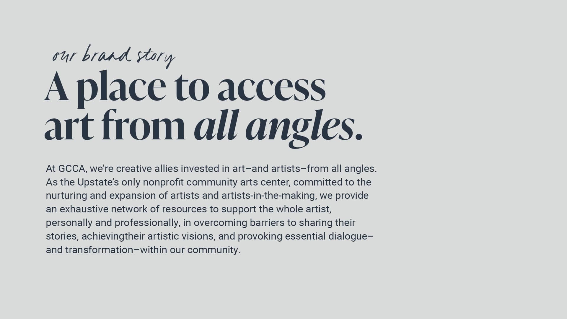
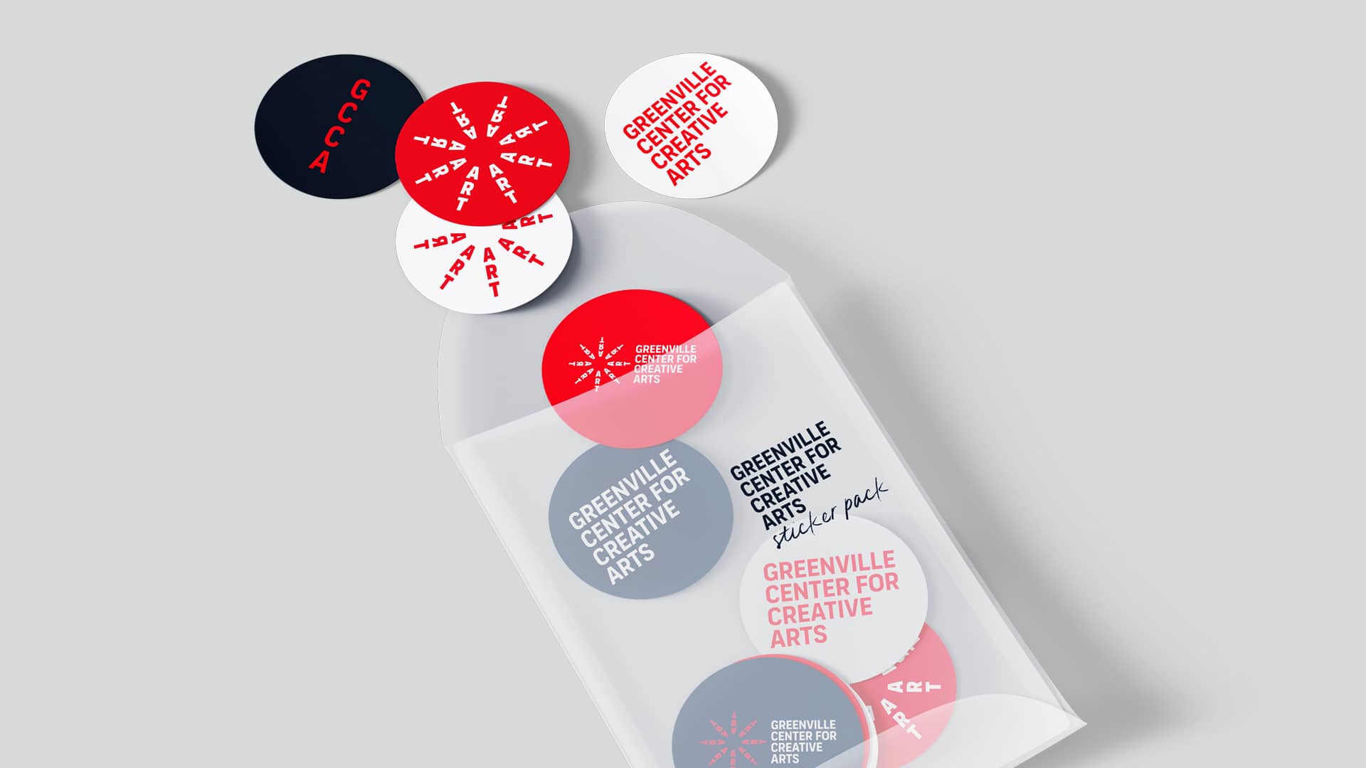
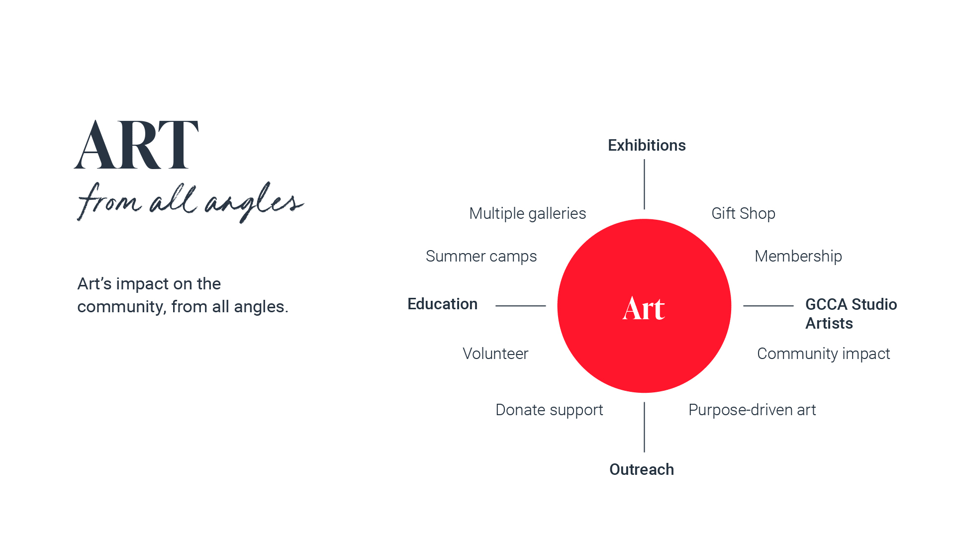
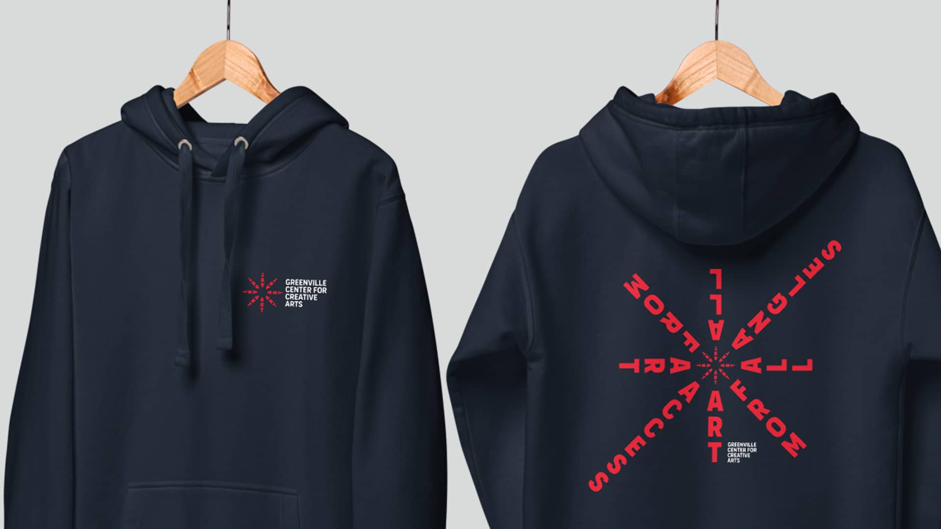
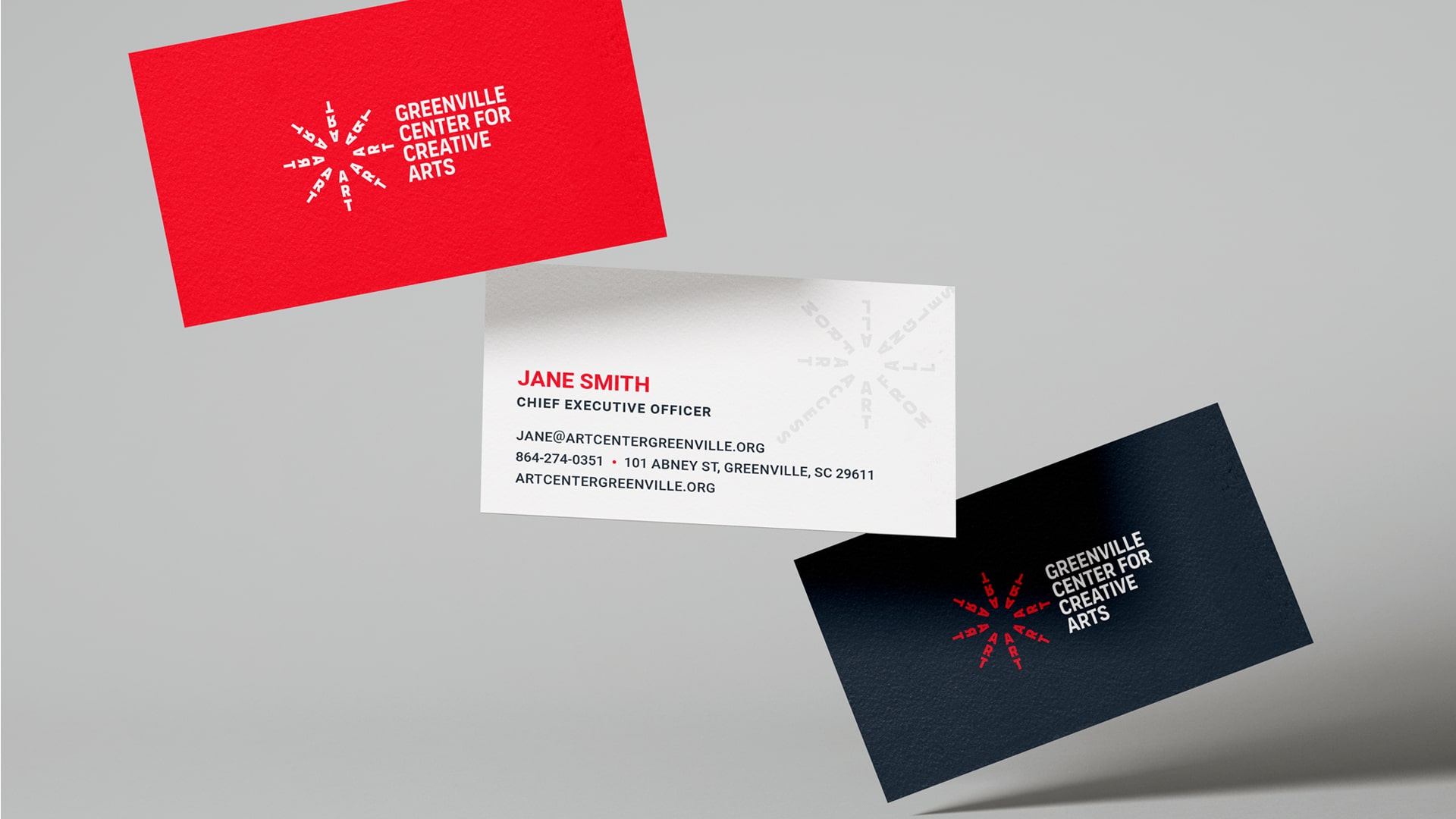
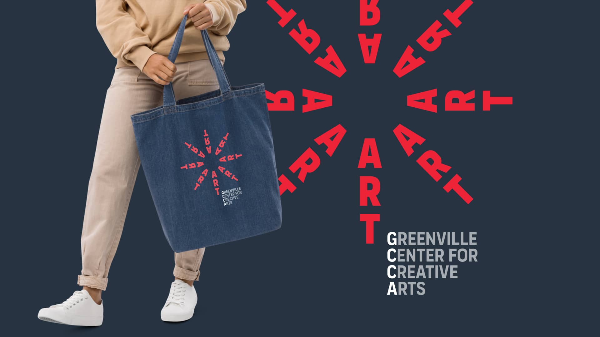
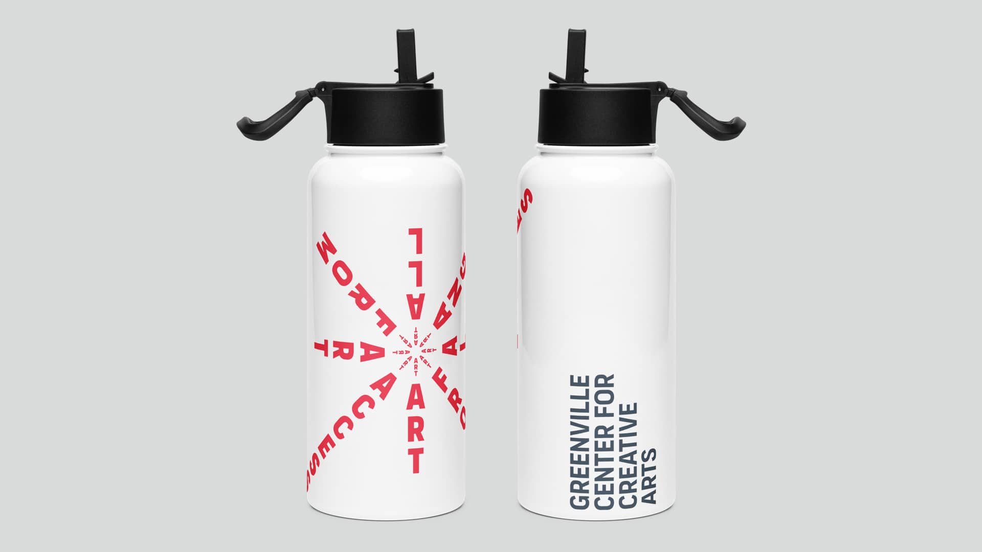
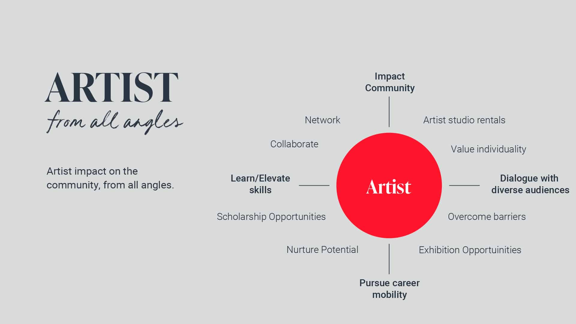
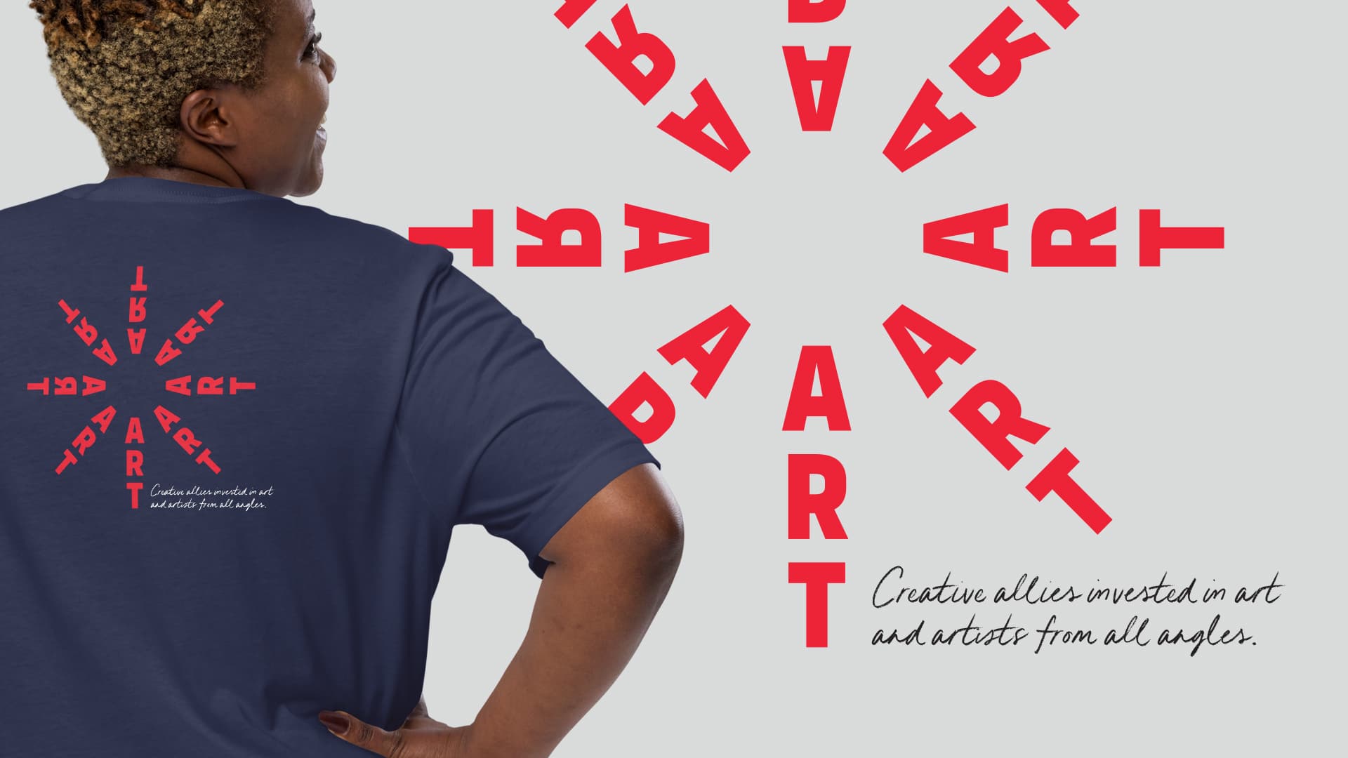
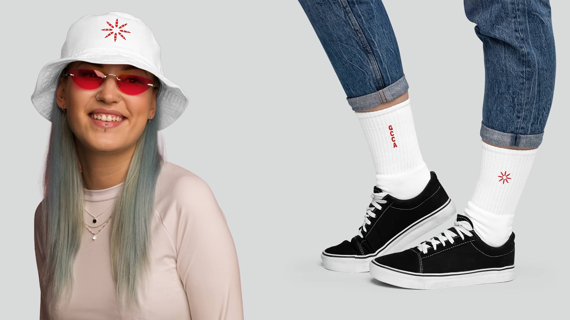
FUEL strengthened Greenville Center for Creative Arts’ brand for its 10th anniversary by creating a meaningful new brand strategy and designing a memorable symbol—the Art Spark—that reflects the organization’s new positioning. The logo features the word “ART” set at different angles, representing the idea of accessing and engaging with art from every perspective. It serves as a dynamic emblem that the community can proudly rally behind. To extend the visual language, FUEL also developed the tagline as a graphic element, reinforcing the connection between the brand’s positioning and its logo.
Let’s ignite your brand’s full potential. Reach out to learn more using the form below.
All fields are required
Can’t wait to chat!
Courtney Beasley,
Executive Director, Marketing and Growth Strategy
Contact / Press Inquiries
Our experts are on tap to talk all things marketing strategy and building a brand that ignites demand. Reach out using this form to contact our team for press inquiries.
All fields are required
Can’t wait to chat!
Meredith Kinsey,
President and COO
Contact / General Inquiries
Can’t find what you’re looking for? Use this form to reach out to our team for help.