Brand design is brand communication. And while great emphasis is placed on elements like logos, typography, and color palettes, brand visuals and photography – the ways your customers or clients are represented and how they see themselves interacting with you – is equally as important. And sometimes, it pays off to take a less literal approach.
Overview
A new brand design
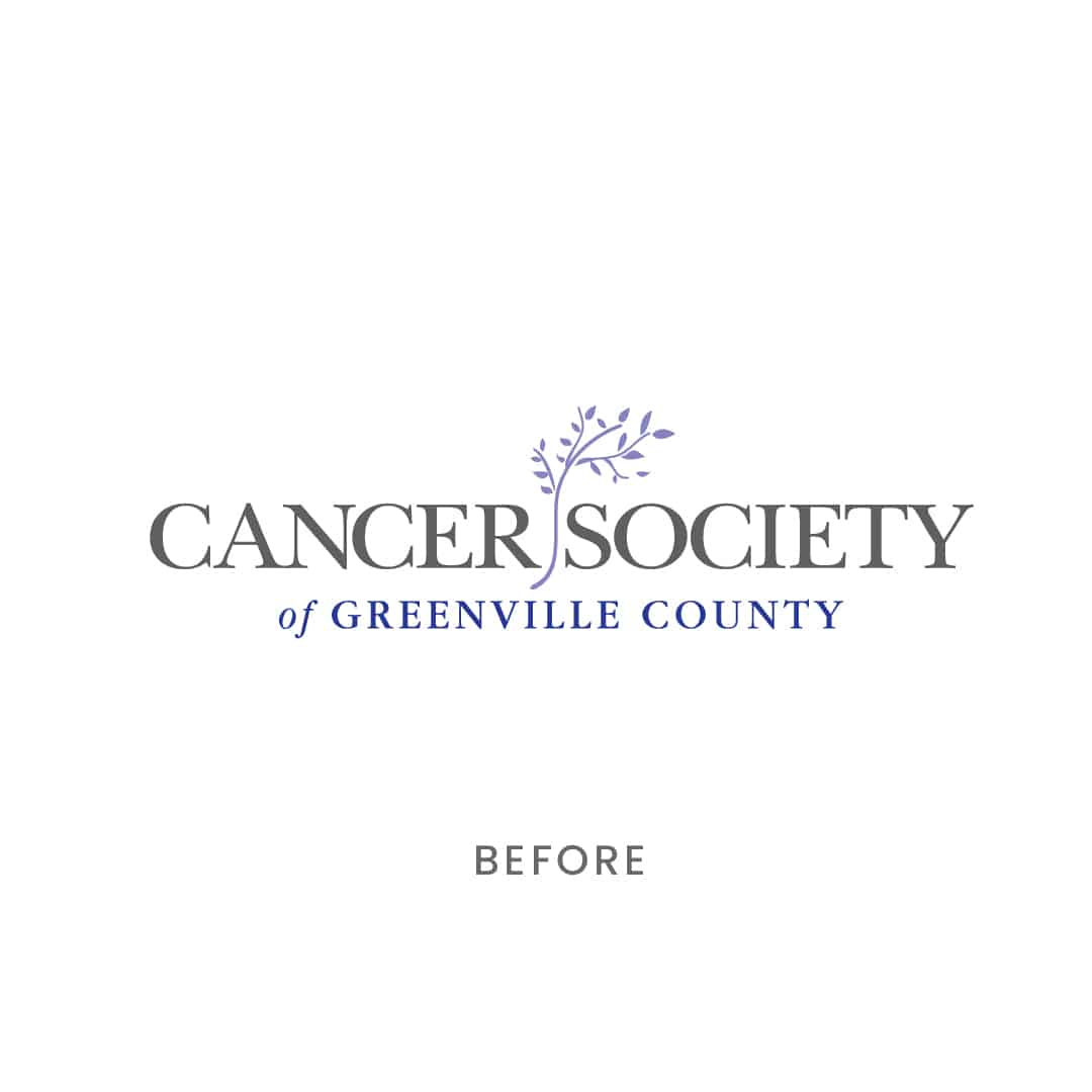
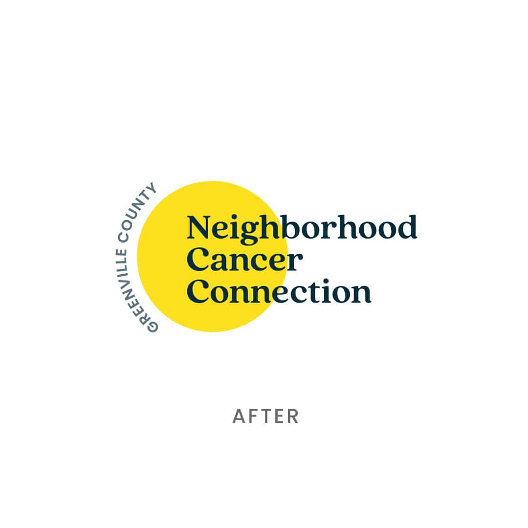
When your brand identity no longer aligns with your vision or audience, we recommend considering a rebrand. Even if there’s a good deal of brand equity built within your name, sometimes you can find that even the name itself no longer suits the brand’s goals. This is where the Neighborhood Cancer Connection found itself (formerly the Cancer Society of Greenville County). Between brand confusion with other cancer-related nonprofits and knowing they had outgrown their current brand identity, the team was eager to dive into, and refresh, both their brand strategy and identity. They wanted the brand to adapt to and reflect its diverse community and its diverse needs, and communicate its community-first values both visually and verbally.
How do you visually represent a topic like cancer? It’s a sobering subject matter that is hard to talk about, and yet nearly every American is impacted by it. Survivors, caregivers, friends, family, and those recently facing a new diagnosis seek refuge at the Neighborhood Cancer Connection.
To help the organization navigate this delicate topic, we took a step back within the branding process and looked at what Neighborhood Cancer Connection offered. In other words, how they wanted their organization to feel when someone came looking for their services or a worthy cause to donate to.
The Strategy
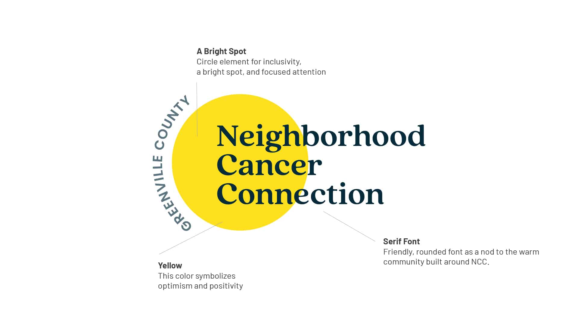
A Bright Spot
The Neighborhood Cancer Connection has served its local community since 1964. Over those 50 years, it built up a strong support system. Considered a place of refuge, the Neighborhood Cancer Connection had a passionate, deeply caring team behind-the-scenes, an active and supportive board, and a legacy of warm, continuous support that extended to the family of its clients, too. In many ways and from many points of view, the Neighborhood Cancer Connection was described as a “bright spot” in the lives of its clients and their families – an insight we made sure to bake into its new rebrand.
Representation Matters
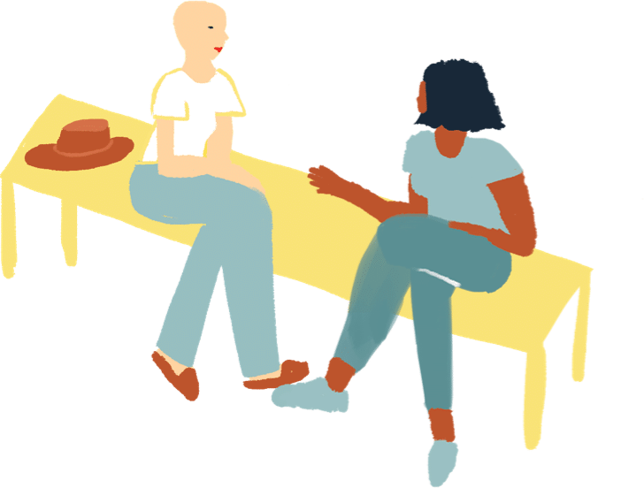
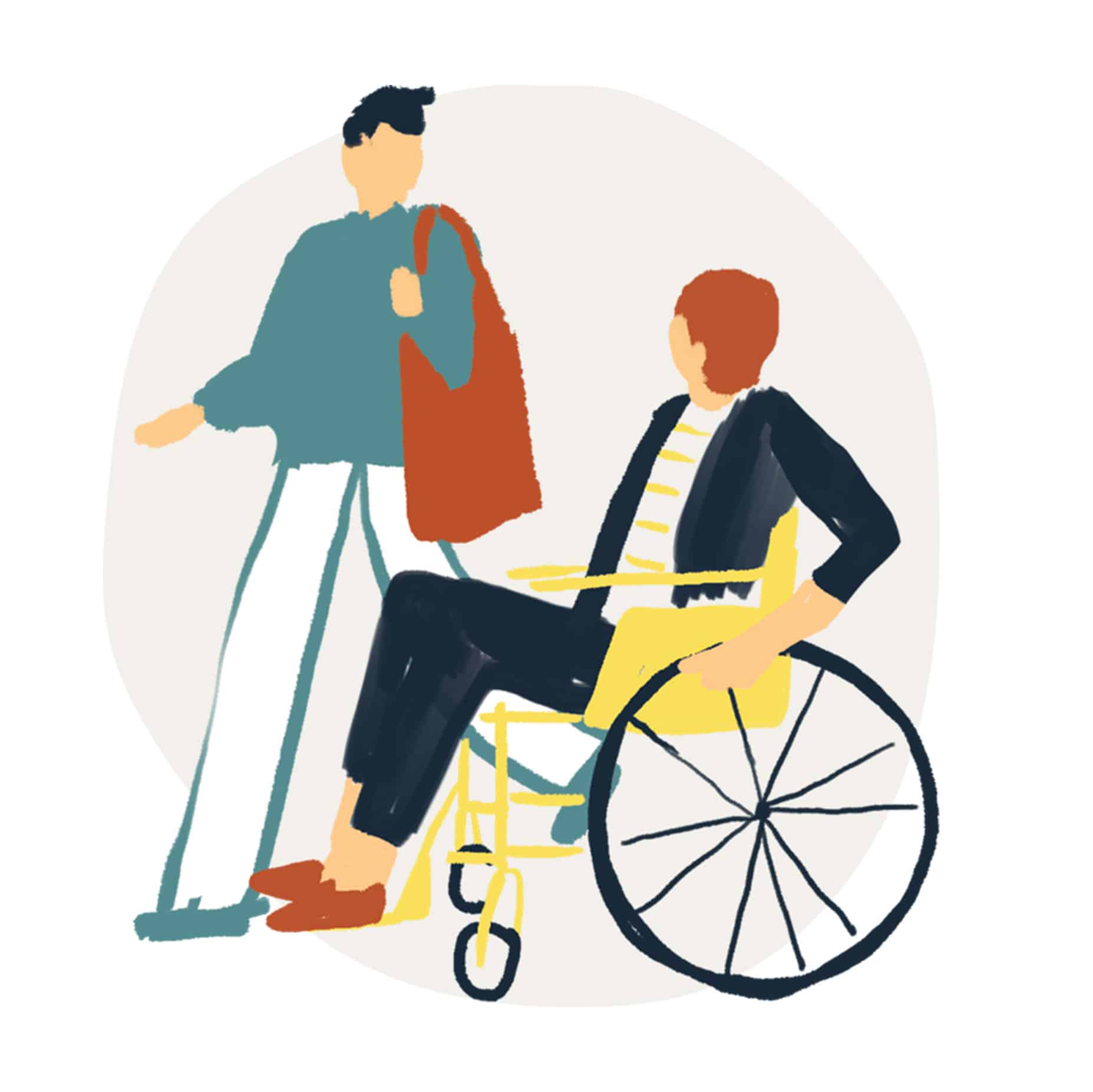
“Love your neighbor” is one of the core values of Neighborhood Cancer Connection – a value the team takes quite literally. For us, it was critical for the visual language of Neighborhood Cancer Connection to reinforce that sentiment. We asked ourselves: “How do we communicate that feeling of love and community support while also representing the patients respectfully?” In addition to complicated relationships with cancer, they also come from a range of backgrounds, ethnicities, ages, and unique needs. It became clear very quickly that photography was not the answer. Not only did stock photography feel impersonal, clinical, and stale, but custom photography was also ruled out due to privacy concerns.
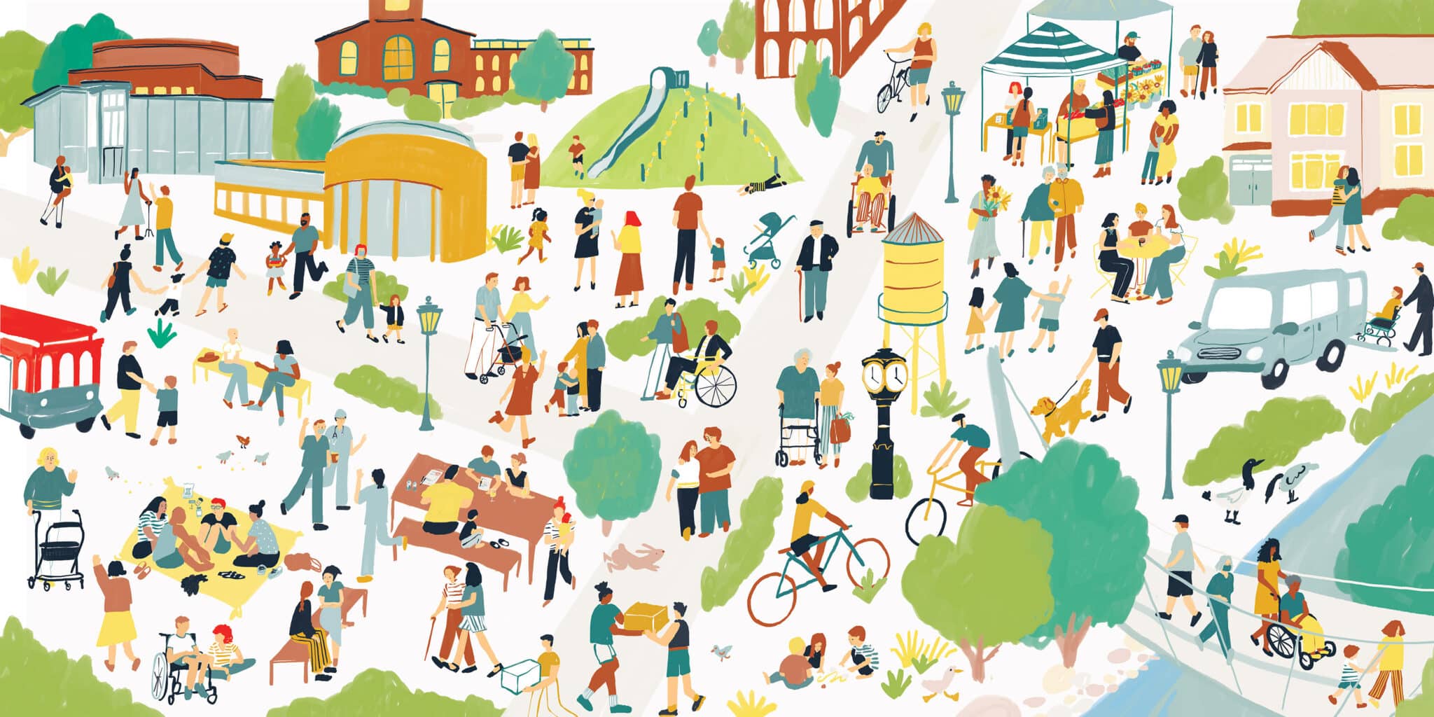
We found the answer to this visual gap in local Greenville illustrator Karen Schipper. Not only was she the right fit style-wise, but she was also passionate about Neighborhood Cancer Connection’s mission.
Community First
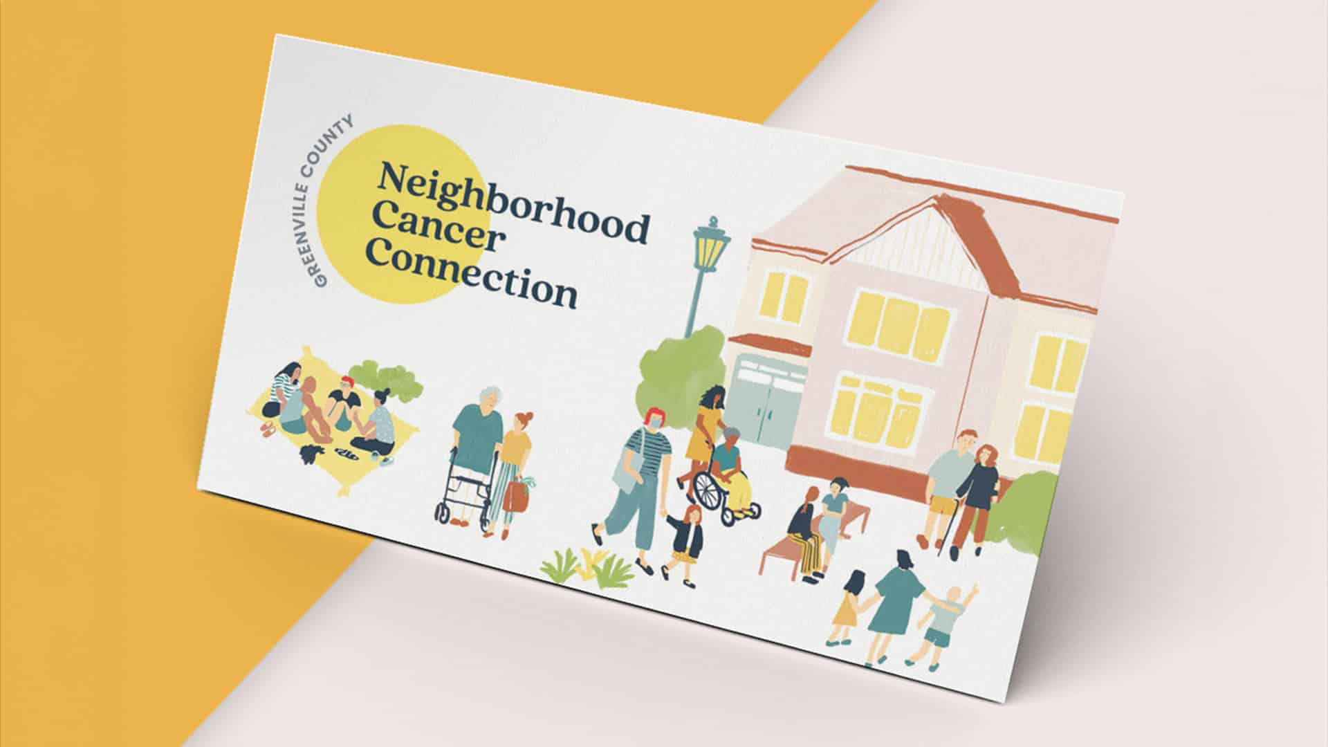
Once we determined an illustration approach to continue our brand development, we created a list of essential illustrations. They included neighborhood-specific details and diverse demographics captured within a spectrum of sizes and mediums. We considered everything from iconography on the website to NCC’s new building – perhaps one of the most important pieces to the organization. We ultimately decided to create a master illustration for the new building and extract smaller scenes for various purposes.
Icons and Representation
While working on our illustration wishlist, we realized this art could also be a perfect fit for the iconography for their service pillars, representing everything from nutrition to counseling to medical equipment. Using this hand-drawn illustration style added a softer representation of things that otherwise might feel overly medical. Including illustrated items such as wigs and Ensure made these things feel much less sterile.
After the list was made, Karen got to work, ensuring that diversity within the community was represented and that it was clear that it takes a village to help each other during times of need. The illustration focused on Greenville County, bringing in landmarks such as Liberty Bridge from Downtown Greenville and NCC’s new building that recently broke ground.
The finished piece was layered with beautiful moments representing the community and all of the ways it shows up for each other, while also inviting you to take another look at the big picture each time you see it.
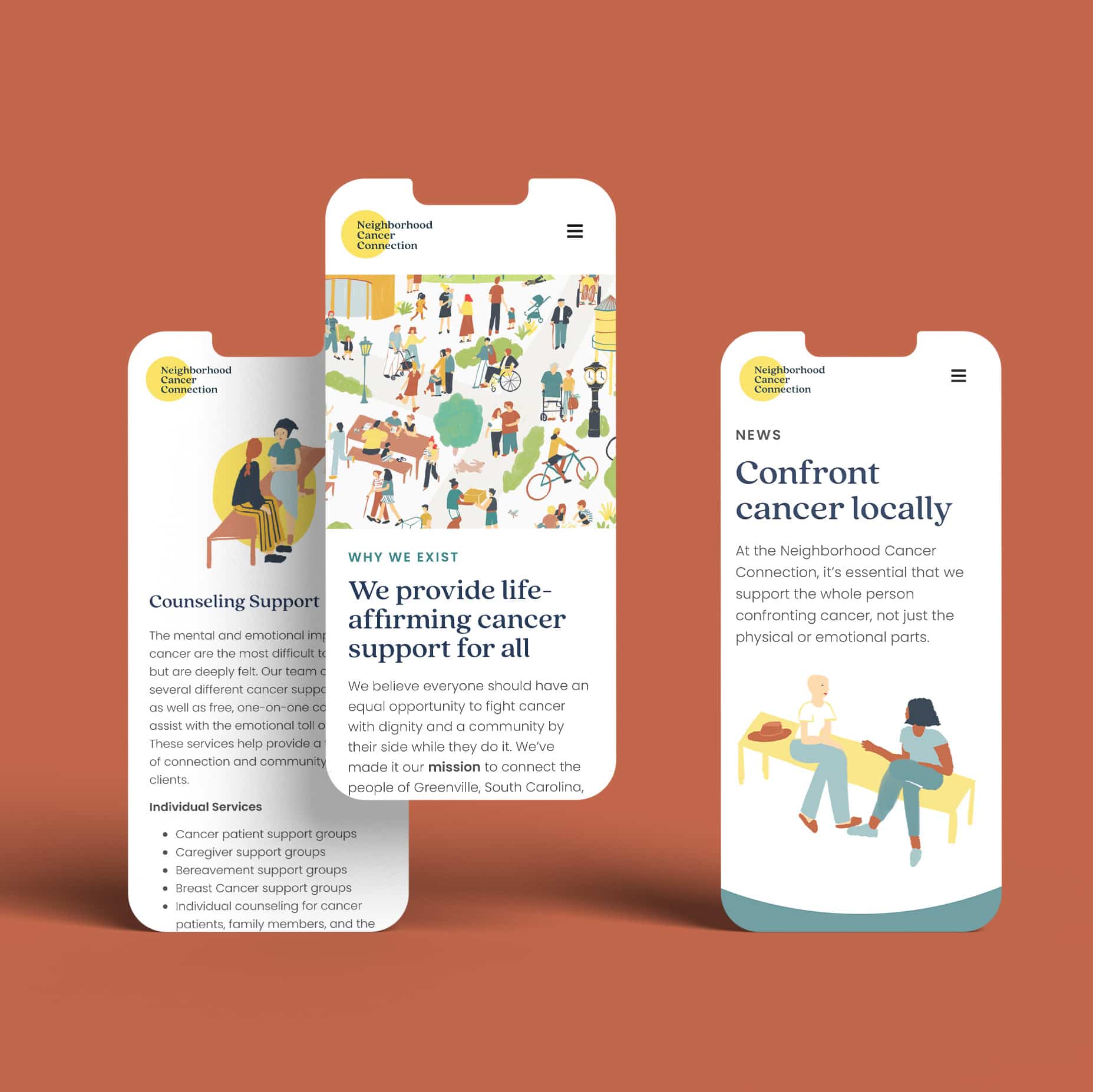
Usability for the Web
After the visual brand identity was solidified, it was critical we translated it into a website that donors and clients could easily navigate and use to find key information, including how to donate, where to fill out patient referral forms, and how to access the latest event information. NCC wanted to make sure that all touchpoints, including their website, laddered up to their position as a “bright spot” in the community.
The Results
A Warm Brand
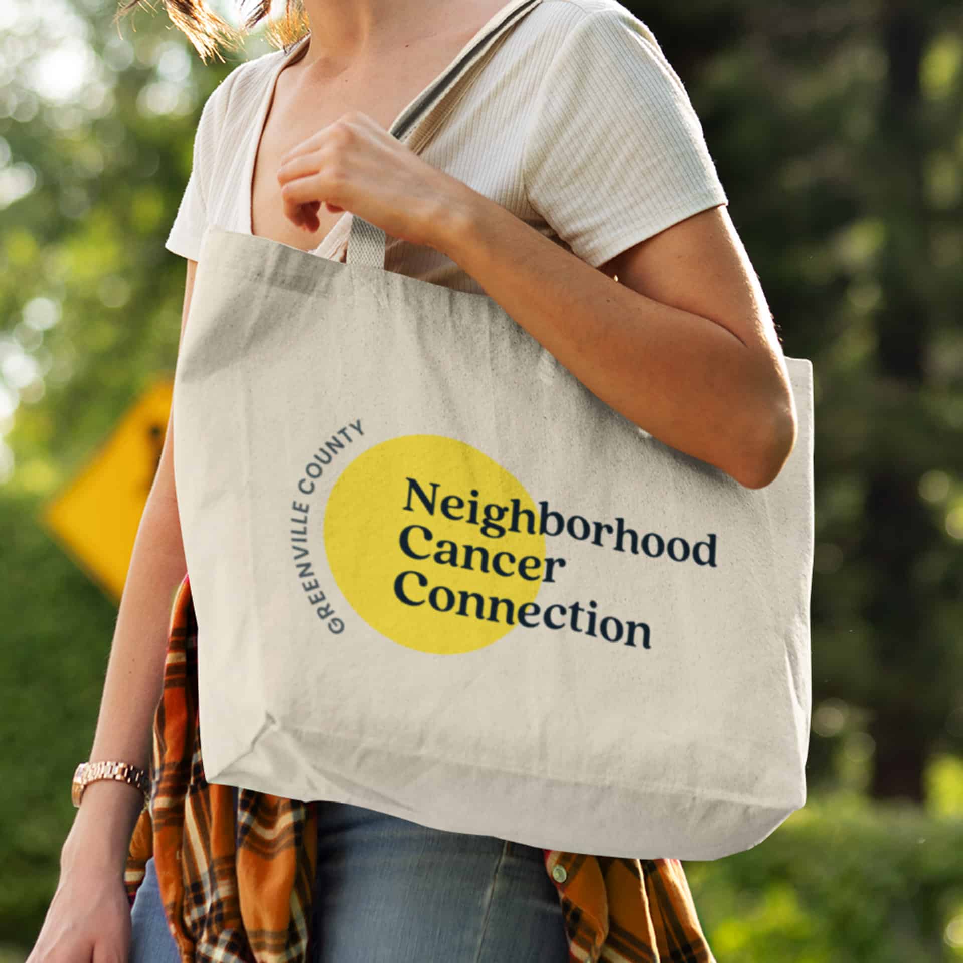
Our collaboration with Neighborhood Cancer Connection and local illustrator Karen resulted in a piece that would keep on giving and evolving. Under its previous brand, NCC struggled with an outdated brand identity, no visual language to communicate its story, and a complete lack of assets. Now, the brand has a new brand identity rooted in its vision and mission, a style guide for its brand design, a library of custom illustrations to use in a variety of mediums, an updated website aligned with their needs, and signature artwork to mark the start of the brand’s new beginning.
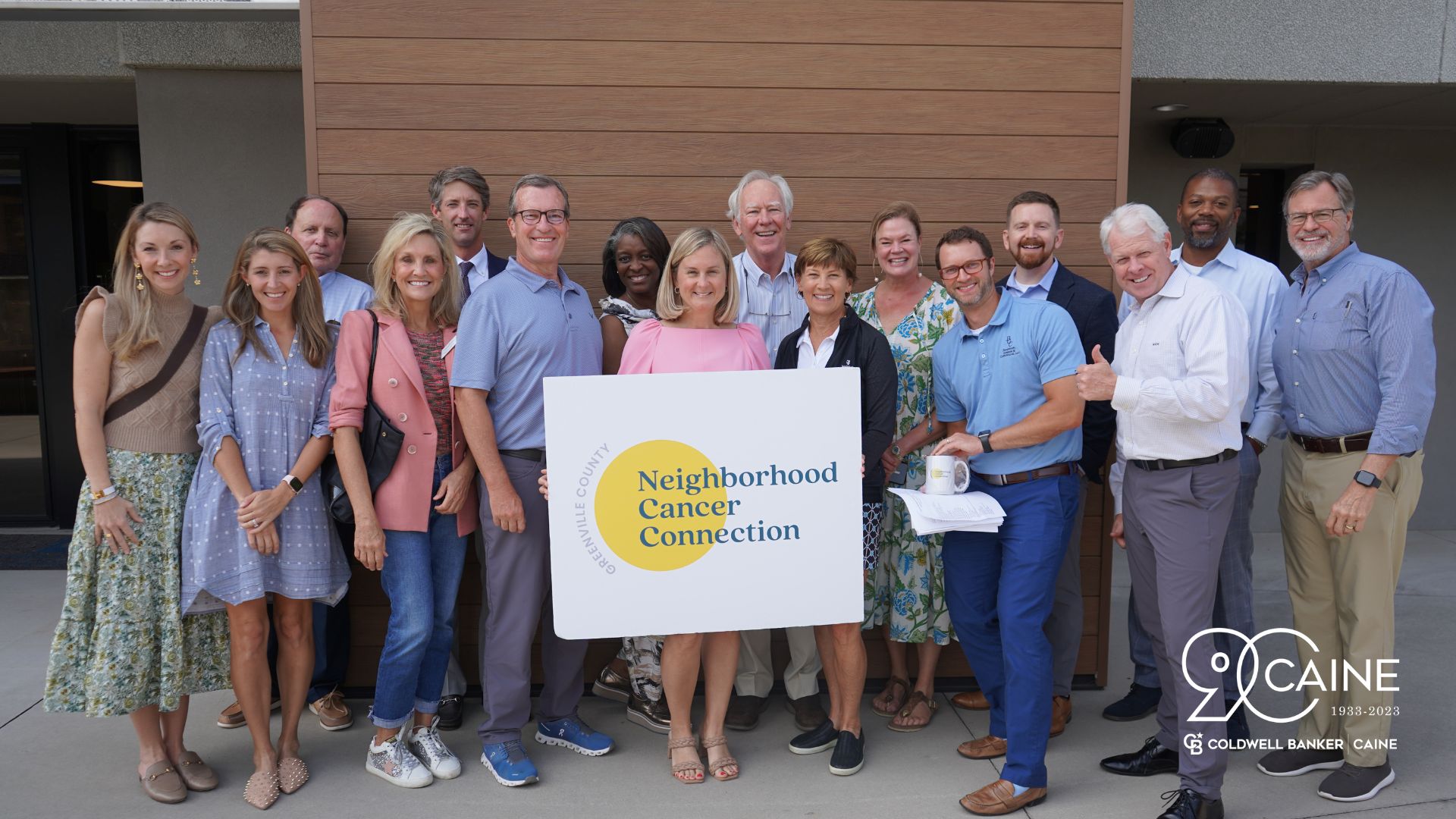
During its new brand launch, volunteers, past clients, community members, and board members welcomed the transition to Neighborhood Cancer Connection with open arms, helping earn the brand over three million impressions from local media coverage.
Awards
AAF 2023 Silver Award – Brand Design
AAF 2023 Silver Award – Logo Design
AAF 2023 Silver Award – Stationery
AAF 2023 Silver Award – Website
“The entire FUEL team is incredible to work with. Their holistic, client-centered approach was what initially drew us to them for renaming, branding, web development, and a public launch. I knew we had the right partners by our side at each phase. They are particularly skilled at finding just the right words and images to capture the essence of our mission and then using a fresh, modern, creative approach to communicate that. Our final product is something our whole team is proud of and will take us to the next level of development.”
Let’s ignite your brand’s full potential. Reach out to learn more using the form below.
All fields are required
Can’t wait to chat!
Courtney Beasley,
Executive Director, Marketing and Growth Strategy
Contact / Press Inquiries
Our experts are on tap to talk all things marketing strategy and building a brand that ignites demand. Reach out using this form to contact our team for press inquiries.
All fields are required
Can’t wait to chat!
Meredith Kinsey,
President and COO
Contact / General Inquiries
Can’t find what you’re looking for? Use this form to reach out to our team for help.