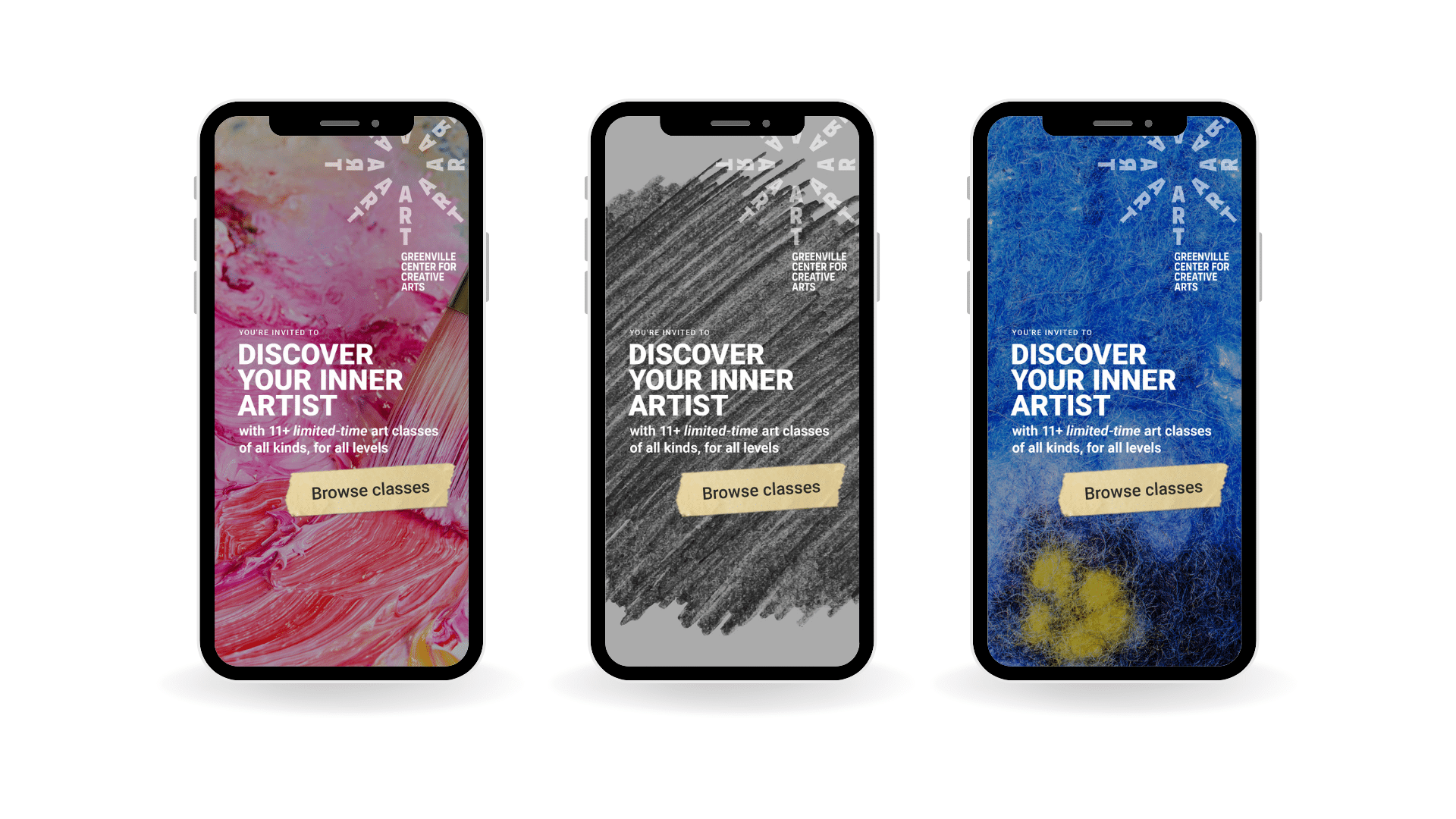
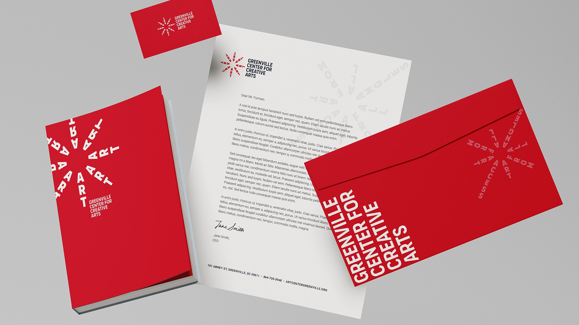
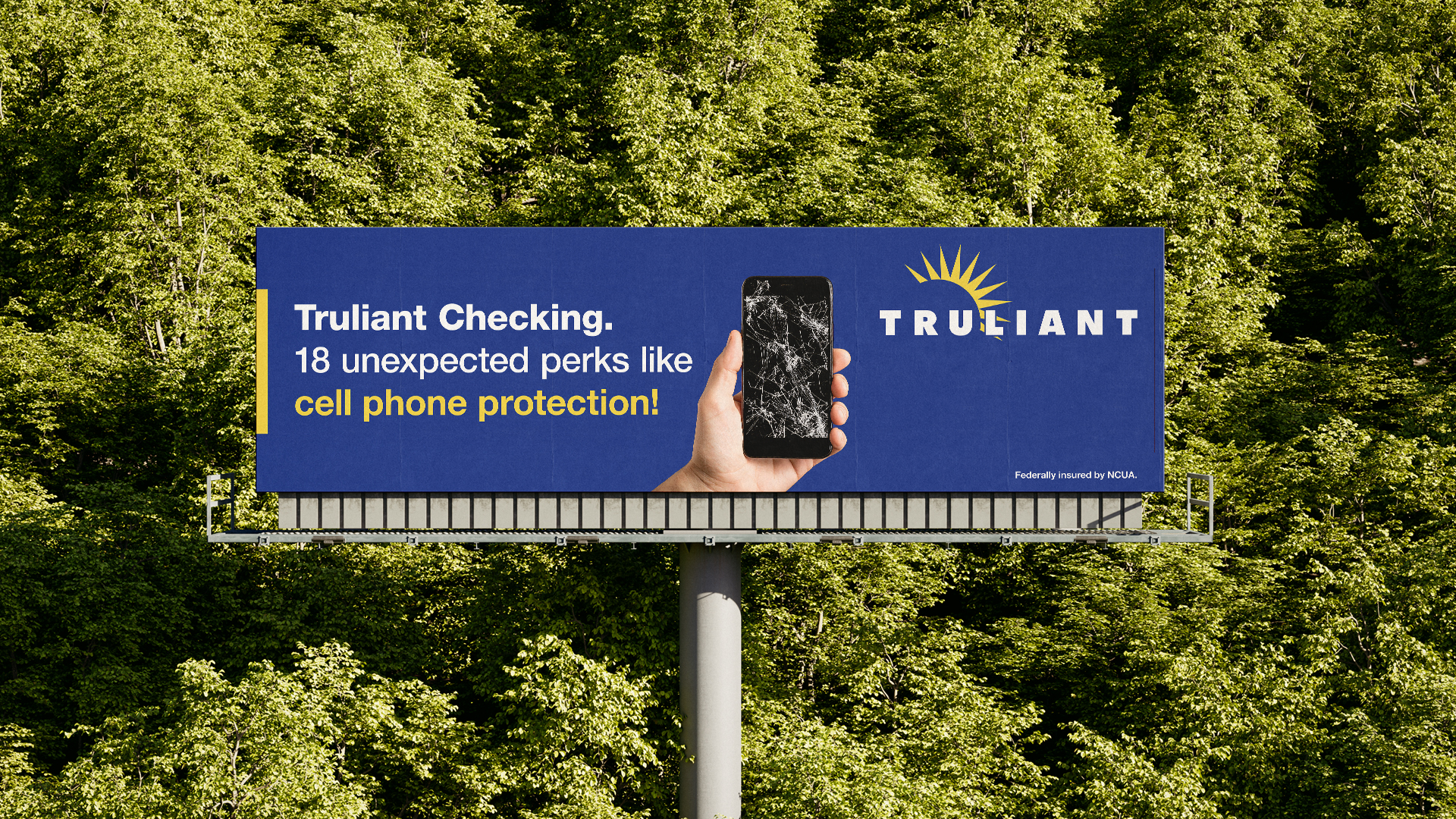
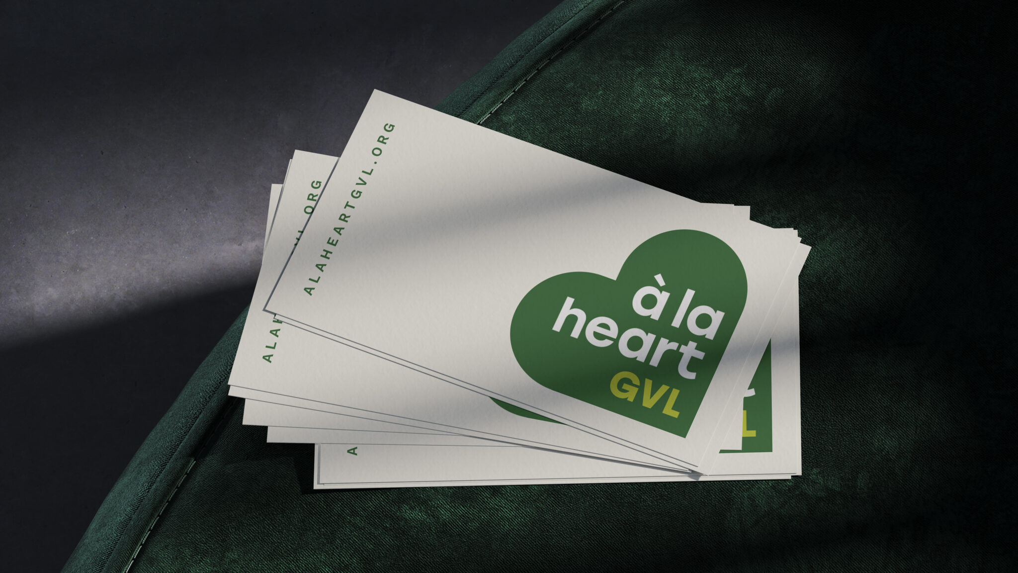
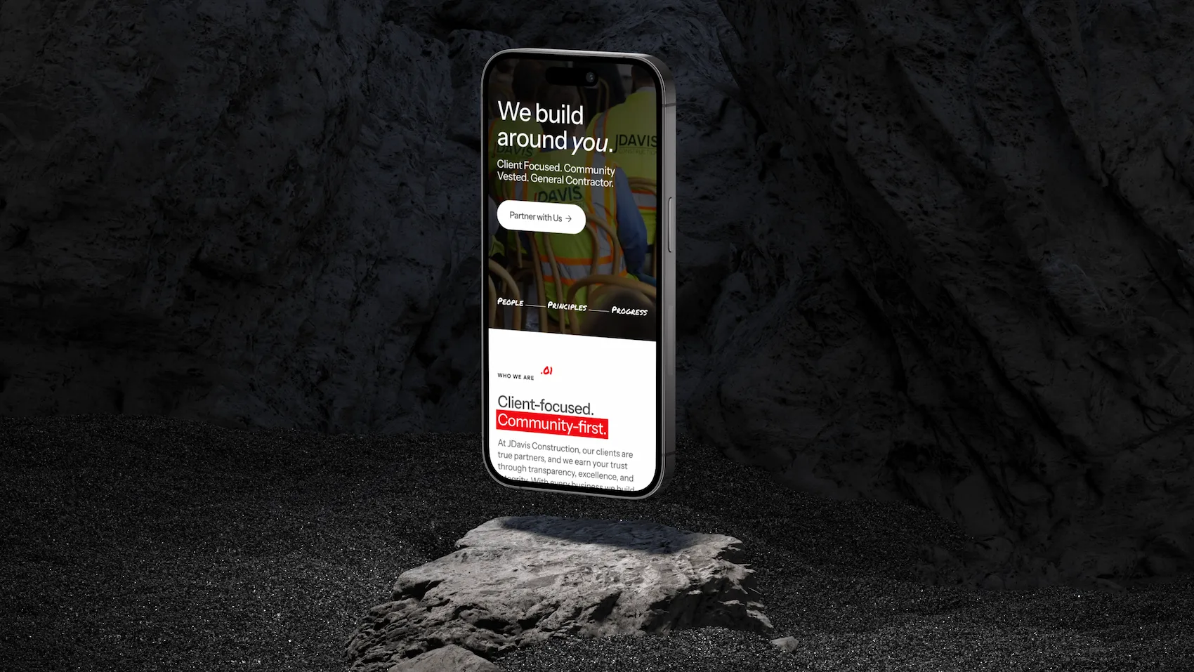
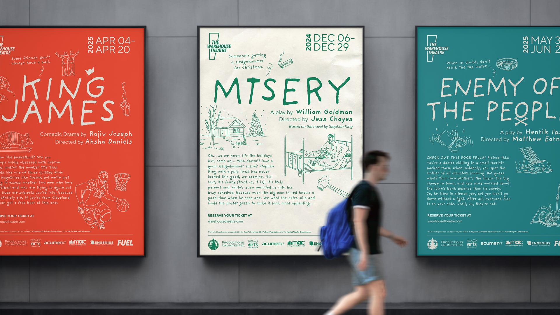
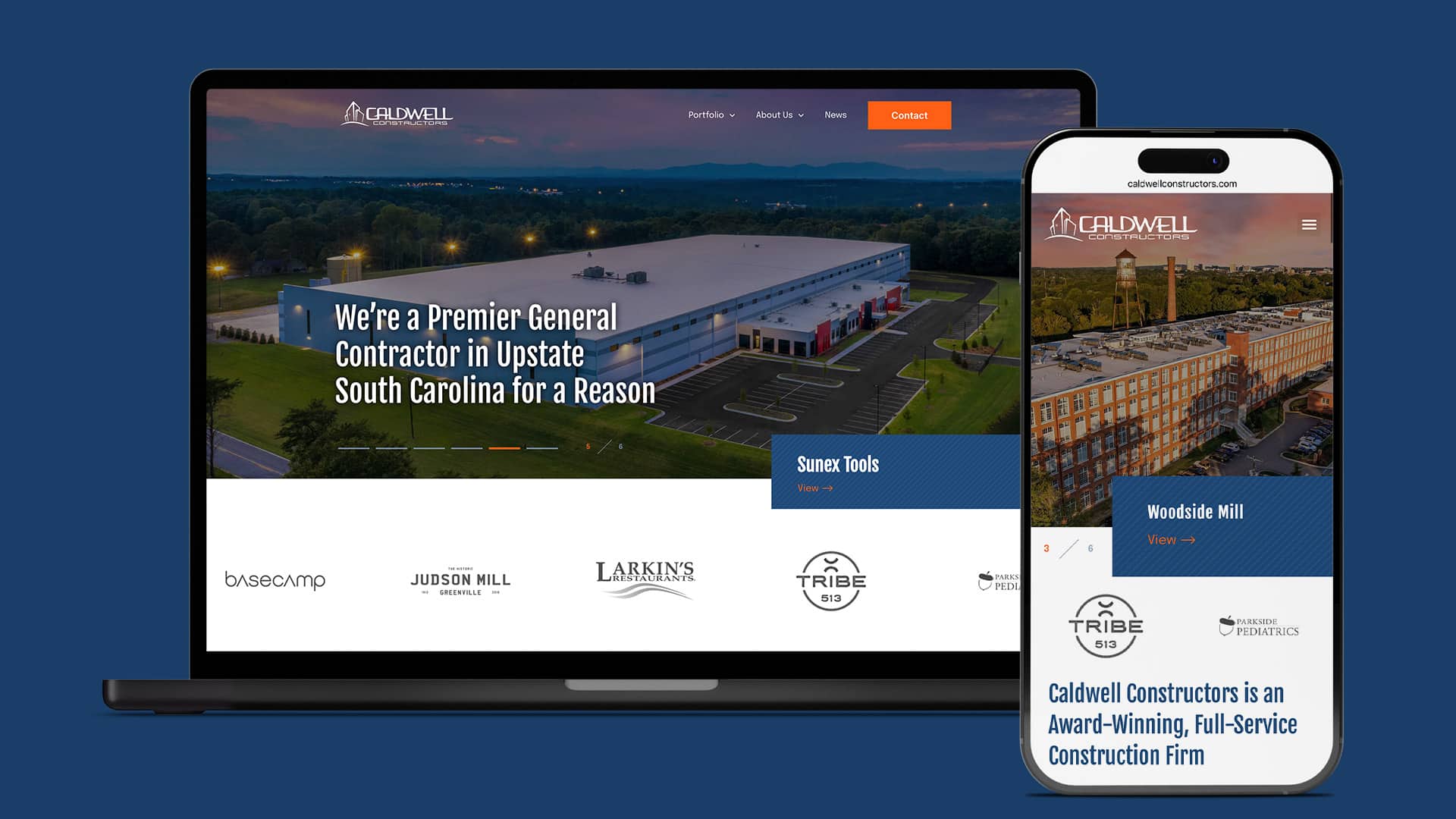
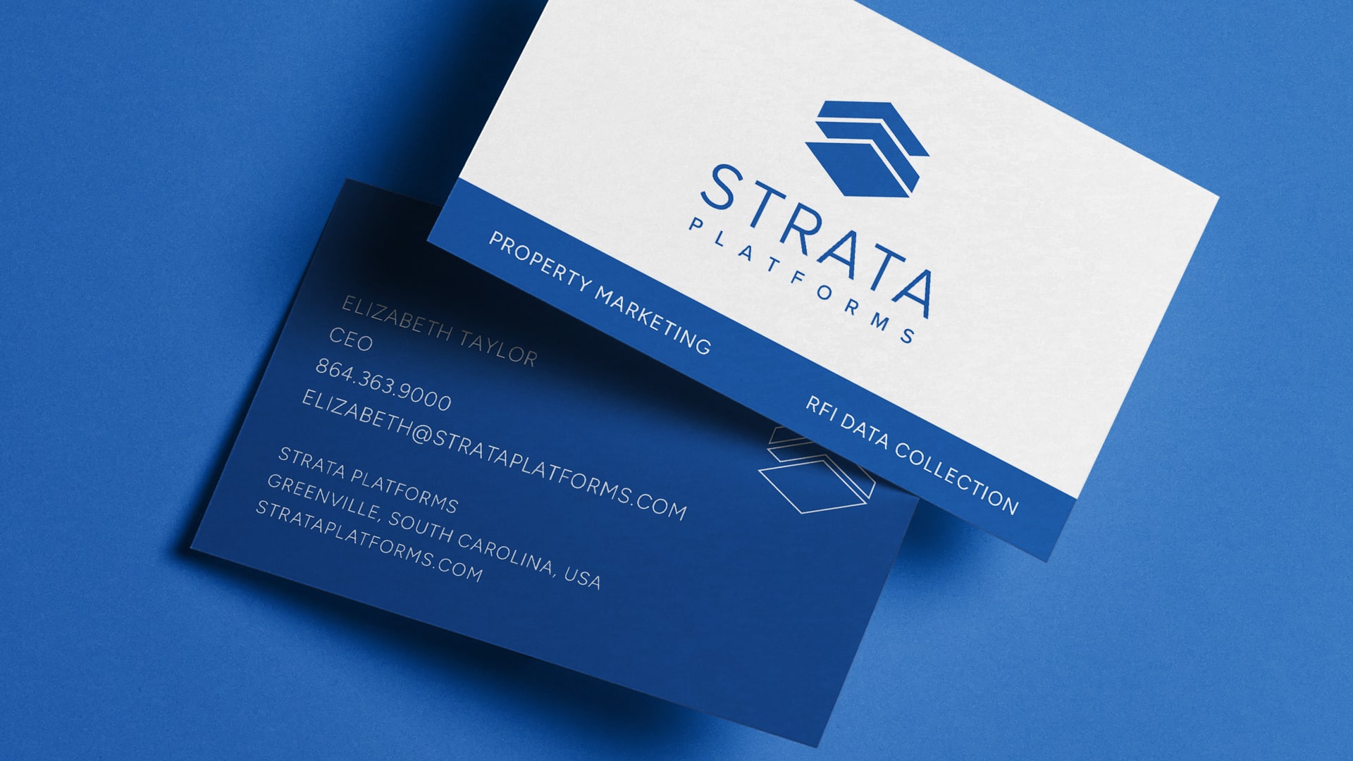
Back to Case Studies

SANDLINE

Information needs intelligence

How do you challenge the status quo of a risk averse industry without causing alarm or distrust, but instead create differentiation and opportunity? Value? Our partnership with Sandline Global, a litigation support and eDiscovery provider, provided all the answers – and opportunity – we needed.

Sandline Stationery Suite

Overview

Making “Meaning” eDiscovery’s most Caluable Currency

Information abounds; it’s only as valuable as it is meaningful. Sandline Global had the experience and brain power to interpret enormous data piles and deliver insights, but it wanted to do more and go further than industry expectations. Instead of creating a client-dependent relationship anchored in low visibility of processes (the how), the SG team wanted to empower its partners to reach their highest potential by providing visibility into the entire Sandline difference: a mentality, and identity, rooted in their core values.

The Challenge

No Distinct Role or Purpose

There are literally hundreds of litigation support vendors offering identical services. We knew creating a unique brand identity and positioning among “twins” would require delving deeper into Sandline’s core: personality traits, approach to work, motivations, and ultimately, its deepest, emotional purpose. All insights that would help us identify that sweet spot between what eDiscovery clients truly need in a partner and what only Sandline can provide.

Sandline Logo Annotation

The Strategy

Making the Unconscious Conscious

We spent invaluable hours collaborating directly with the team; mining insights from their own industry experience and perspectives on Sandline, and also pressure testing some of our own theories. We analyzed competitors’ positionings, discussed the Sandline team’s vision for the company, parsed the nuances of their approach, and began to slowly fill in the gaps. Once we had a good sense of what drove the company and motivated the team, we applied our preferred method to all things brand identity: archetypes.

Empathy. Clarity. Efficiency.
In our conversations with the team, the theme of industry stagnation appeared over and over. eDiscovery providers were shifting from thoughtful discovery, forensics, and analysis to data reporting and evidence storage, short-changing their clients and bloating their own margins in the process. In contrast, Sandline’s team had genuine empathy for the pressure and stress legal teams were up against. They also possessed an obsession for identifying crucial digital evidence, and the expertise and intellect to guide the process quickly and efficiently for clients. In our conversations with the team, the theme of industry stagnation appeared over and over. eDiscovery providers were shifting from thoughtful discovery, forensics, and analysis to data reporting and evidence storage, short-changing their clients and bloating their own margins in the process. In contrast, Sandline’s team had genuine empathy for the pressure and stress legal teams were up against. They also possessed an obsession for identifying crucial digital evidence, and the expertise and intellect to guide the process quickly and efficiently for clients.
Meet "The Reformer"
Legal teams didn’t deserve – and honestly, couldn’t afford – a mediocre vendor. They not only needed a competent partner, they needed someone who would challenge the status quo. Sandline was ready to raise the bar on client and industry expectations, globally, and also dig deeper to uncover what truly sets it apart: a unanimously agreed upon archetype. After hours of workshopping, the team aligned on The Reformer: a “Gentle Rebel” who seeks to improve the existing system, not throw the baby out with the bath water. And pinpointing this changed everything.
The Creative Approach - "Meaning" in every component
Sandline Before and After Logo
Sandline Elements
Sandline Icons
The Typeface
We crafted a visual identity that perfectly walked that balance of operating in a conservative industry but also promising a fresh approach to the old way of doing things. Through our research and review of Sandline’s competitive space, we found an overabundance of sans serif fonts. And while appropriate for the subject matter, on behalf of The Reformer, we naturally wanted to challenge that. We chose a clean, modern serif typeface to complement their bold ideas, something to represent their strength, dependability, authority, and maturity.
The Color Palette + Brand Element
As far as colors go… The deep navy paired with a neon green was inspired by the bright colors of highlighters and Sandline’s role as an identifier of key insights and information buried in data. The combination of the authoritative blue and white paired with a progressive neon green was bold and unexpected, but also felt established and legitimate. We also applied the neon green to a signature brand element reminiscent of data mapping. Designed to symbolize intelligence, customization, and focus, the brand element provides a much needed visualization of Sandline’s heavily abstract and conceptual work.
The Big Reveal
Our interpretation of their color palette, design elements, and photography communicated Sandline’s serious, authoritative side, while still representing a high-touch, customized approach to each client and challenge, especially the brand’s ability to highlight and deliver what matters most: meaning.

The Results

Unity and Focus

“You don’t know what you don’t know” Now… you know. Before you can invest in branding, you absolutely must invest in uncovering and evolving the brand identity. It’s the foundation, the purpose, the clarity, the everything that empowers the brand to be focused and a creator of value. So the results? One unified brand fully aware of its standing and purpose in the world of eDiscovery.
After working with FUEL, we see ourselves in a different light. Their brand-building approach helped us go back to fundamental steps we skipped, and clearly define our brand and differentiators that impact business.”

— Glenn Hopper, Chief Financial Officer | Sandline

Our partnerships mean everything.

Just ask our clients

Don’t take our word for it. Hear from marketing leaders just like you.

“Essentially, [FUEL] felt like an extension of us by the time the process was over…true storytellers relaying a relevant and engaging story.”

— Jason D. Johnson, Managing Director | The Warehouse Theatre

Work

See our Capabilites in action

See our work at work in the world, and learn about the results we’ve achieved working with brand and marketing leaders like you.

Eye our Portfolio

South Carolina Children’s Theatre

Rebranding SC Children’s Theatre After 35 Years

NCC Website SCreens

Neighborhood Cancer Connection

An Illustrated Brand Strategy

Stand out in the most crowded of markets

Download our whitepaper to learn more.
Contact / Work With FUEL
Let’s ignite your brand’s full potential. Reach out to learn more using the form below.
All fields are required

Can’t wait to chat!

Courtney Beasley, Executive Director, Marketing and Growth Strategy
Contact / Press Inquiries
Our experts are on tap to talk all things marketing strategy and building a brand that ignites demand. Reach out using this form to contact our team for press inquiries.
All fields are required

Can’t wait to chat!

Meredith Kinsey, President and COO
Contact / General Inquiries
Can’t find what you’re looking for? Use this form to reach out to our team for help.
All fields are required

Can’t wait to chat!

Meredith Kinsey, President and COO