Branding agency FUEL refreshes the South Carolina Children’s Theatre’s 35-Year-Old Brand Identity
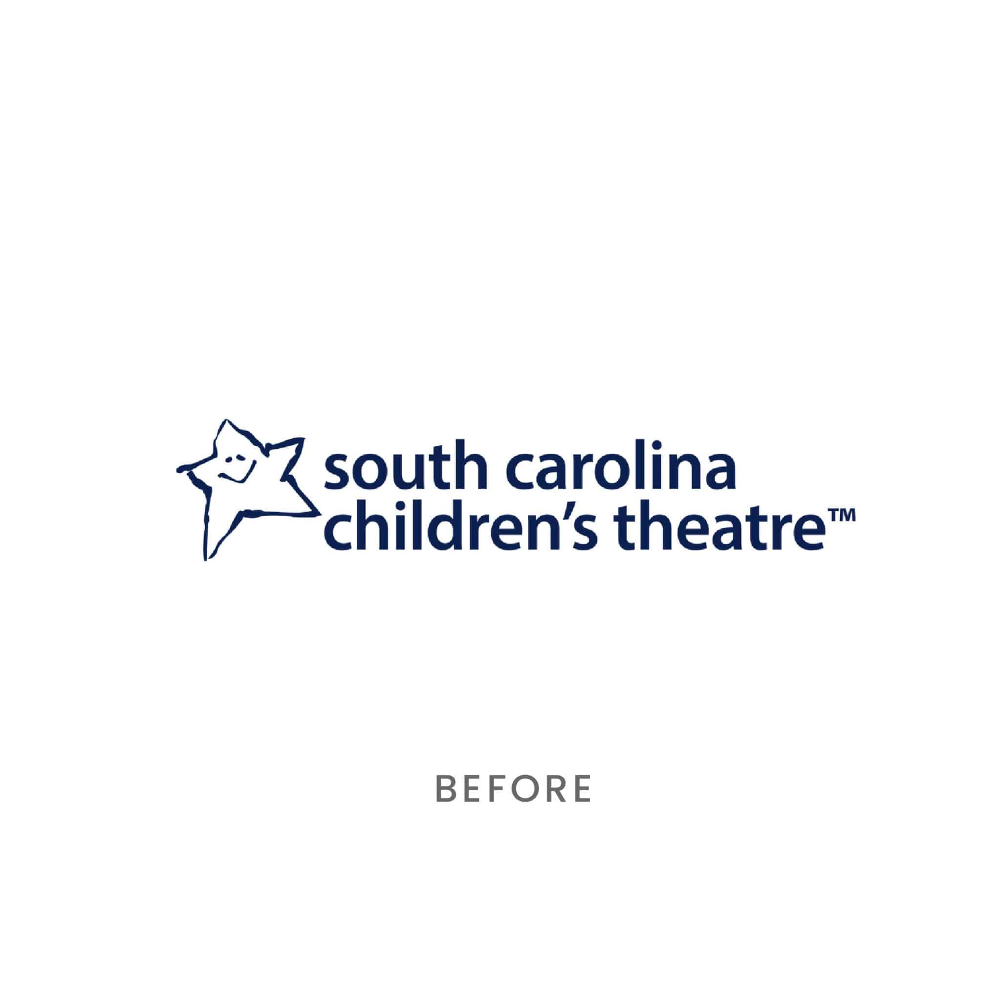
After almost four decades of the same “star” logo as the face of its brand, the South Carolina Children’s Theatre tapped our FUEL for Good Grant to give the theatre a polished, professional refresh – something to reflect the current theatre and its modern audience. We delivered just that.
The Challenge(s)
How to Make a Children’s Theatre’s Branding Look and Feel (Appropriately) Professional
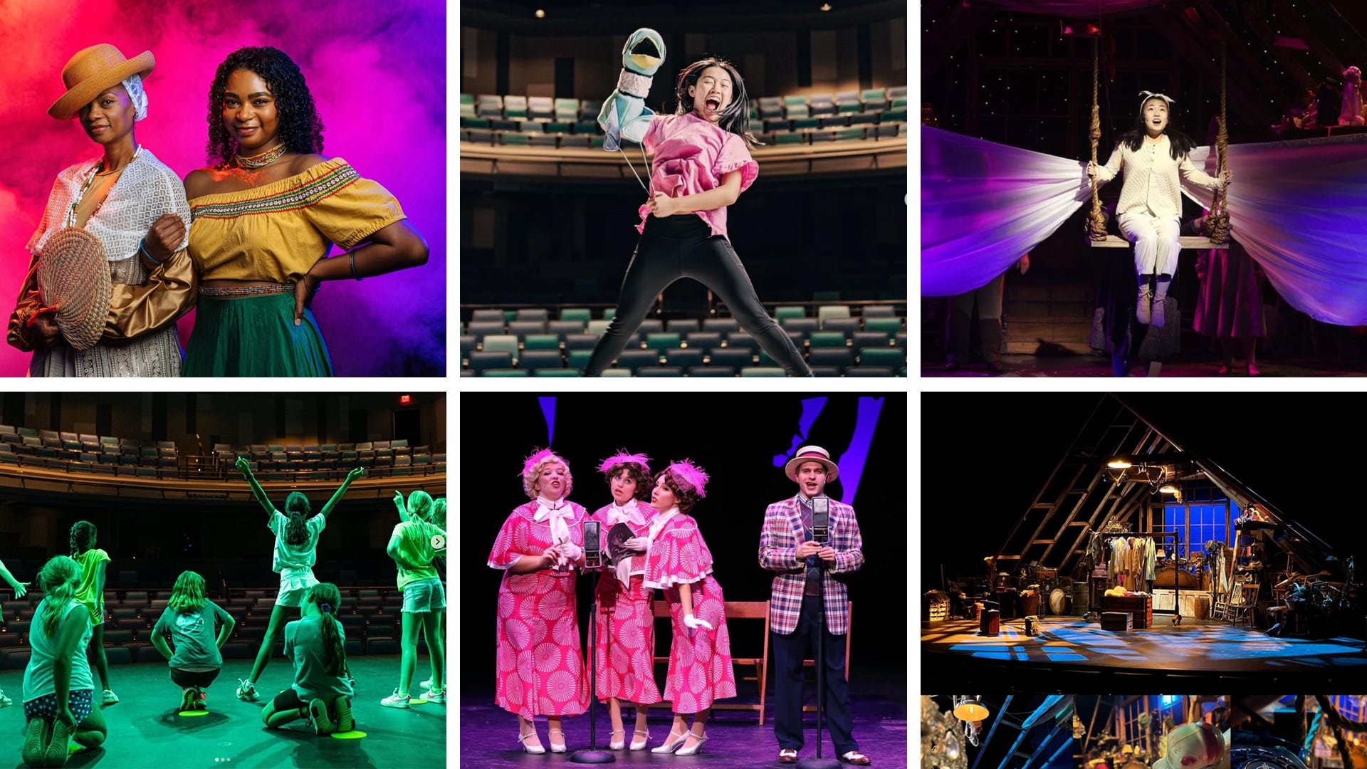
As the only theatre in town that produces work exclusively for young people and families, SCCT’s focus has always been on high-quality, professional caliber productions, and education.
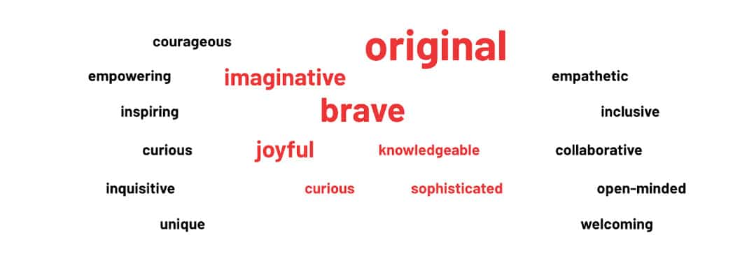
We loved the clarity and wanted to ensure we strategically shaped an accurate brand image. With the addition of seasoned Artistic Director, Matt Giles, and a passionate, experienced team brimming with ideas – and especially insights about the needs of the performers, audiences, and the local community – we had plenty of inspiration to build on. In particular, the team provided a new strategic direction for the theatre, spelled out through updated vision and mission statements, and a list of new values.
Above all, it was important to us that the new brand be relevant; an accurate reflection of the people and community it catered to. And what that community needed most was a safe, inclusive place it could uncover – or nurture – its love for theatre.
Before beginning the branding revamp, we had to back into some other essential brand strategy pieces. Starting with: Who is SCCT as a persona? What are we building this new brand identity on? Around? What core personality traits will dictate its brand image and brand behavior?
Through competitive audits and a brand audit of SCCT itself, we focused on building out the core of the brand first, namely identifying its role in the world via a clear, defined archetype. Very quickly, the persona emerged. Research, interviews, and collaborative chats quickly led us to: The Muse – “a source of knowledge and inspiration that also brings a sense of the magical.”
At their core, Muse brands appeal to people’s desire for inspiration and self-expression. Think: Etsy. Spotify. Pinterest. They all allow their users to explore and discover more about themselves and the world through their product, much like SCCT gives children and its audience the same opportunities through stories and performances.
Besides the Muse’s ability to inspire the creation of art and literature and to give clarity, focus, and motivation to creatives, it also has one crucial strength reflected in SCCT’s strengths too (naturally): facilitating the growth of others. An idea found at the heart of the young SCCT team’s latest mission statement.
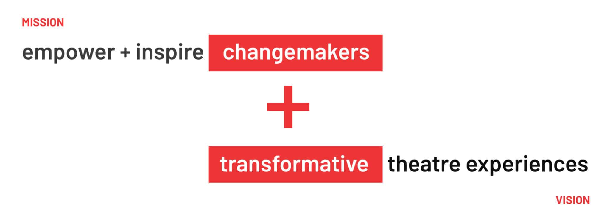
SCCT Mission: To empower and inspire a new generation of changemakers* through theatre.
We define a “changemaker* as:
Someone who has empathy for others and is driven to make the world a better place
Someone who has an inquisitive and open mind
Someone who has the courage to do and see things differently
Combined with the theatre’s new Vision (“To bring transformative theatre experiences to every young person and family in the Upstate of South Carolina”) and Values (curiosity, collaboration, inclusivity, and joy), we had complete confidence that the brand strategy and branding would coalesce into something modern, creative, and distinctive for the theatre and its future (but we are not recommending it remain untouched for another 35 years!).
The Solution
A Vision + Mission-Led Territory
As a Muse brand, it was only natural to try and visualize the transformation that can result from inspiration, but for SCCT even more specifically, the transformation felt like a collective experience, not a singular one. We asked ourselves how to visualize the “changemakers” who SCCT devotes so much time and talent to, without making them seem like child “stars” as the previous branding and logo denoted.
Diversity and inclusion is a top priority within SCCT’s programs, and we wanted the new logo to create the feeling of a diverse collective in transformation. Focusing on the theatre’s acronym of SCCT and some key vocabulary the team requested to come through the branding, we devoted … 17 moodboards to the process of play and error.
Our Branding and Logo Solutions:
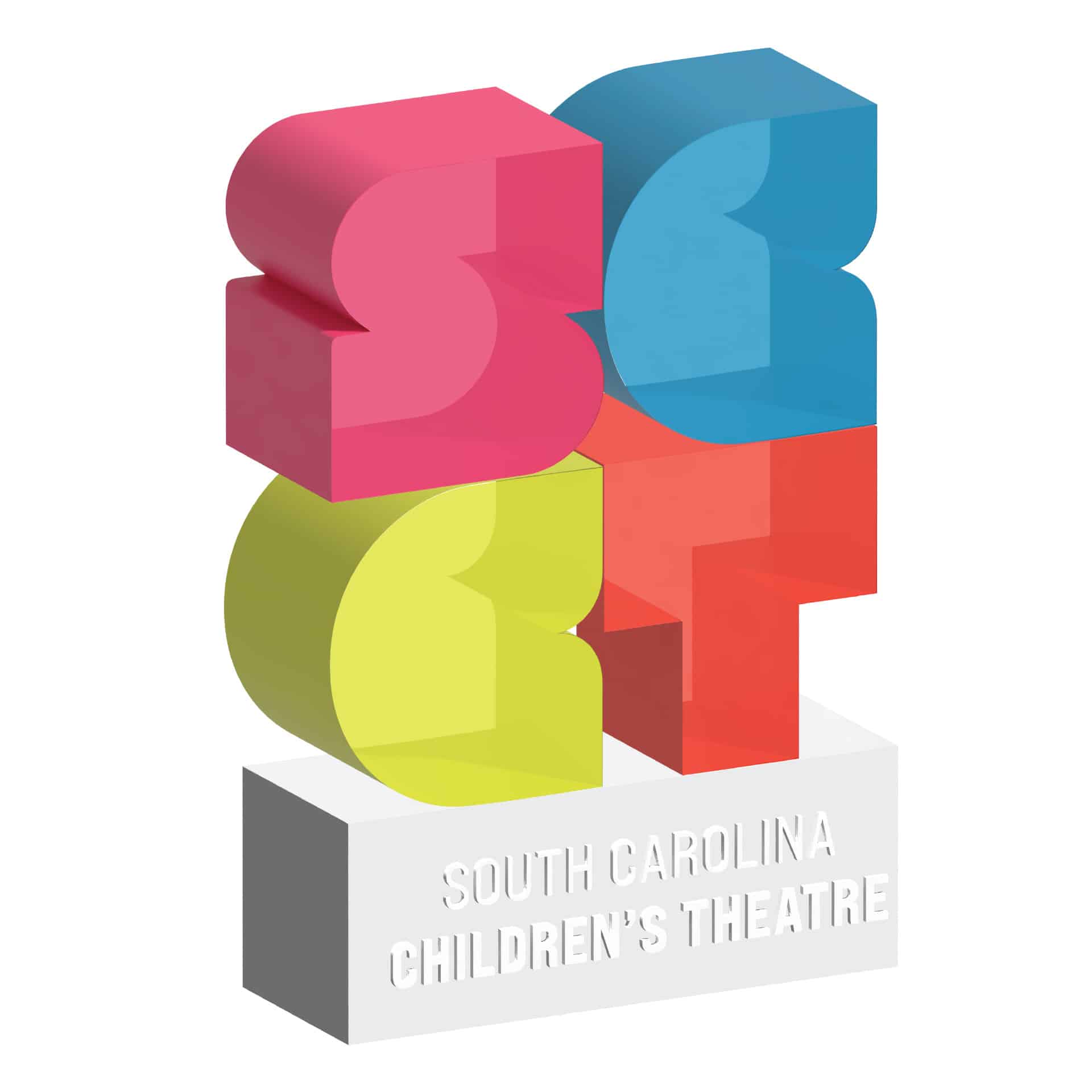
Update the look and feel and legibility of the dated 35-year-old logo to make it modern and inclusive, and one that reflects the mission of SCCT
Consider abstract, more whimsical expressions (nothing stuffy or corporate)
Explore words as art
Emphasize SCCT
Create something exciting and out-of-the-box
Consider inclusivity of teen audience
Ready to see the results?
“FUEL created a flexible design system and visual language full of personality, imagination, and joy to empower the SCCT marketing team and inspire SCCT’s audience.”
— Mary Church Cornette, Head of Creative | FUEL
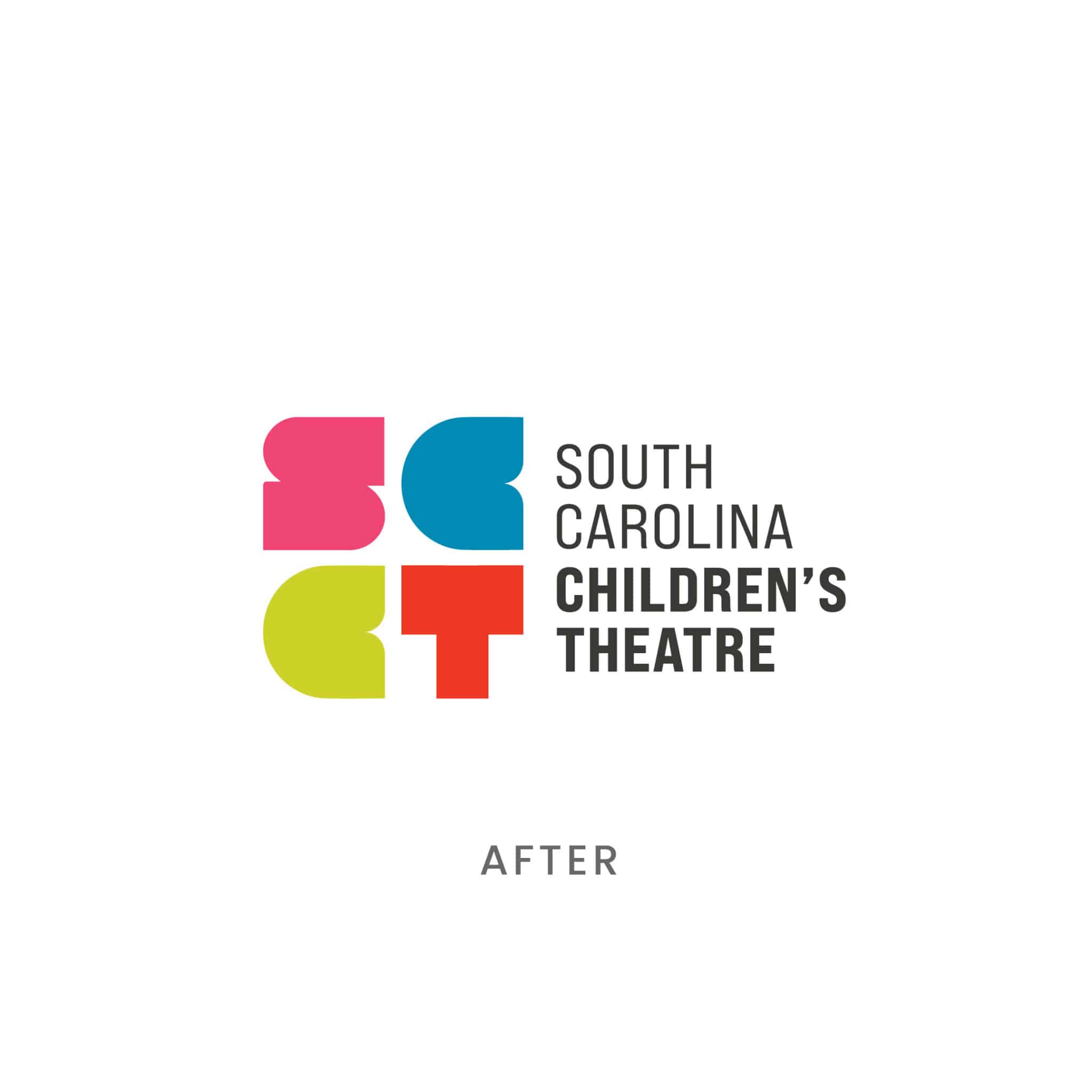
The Results
Branding and logo design rooted in a love of theatre
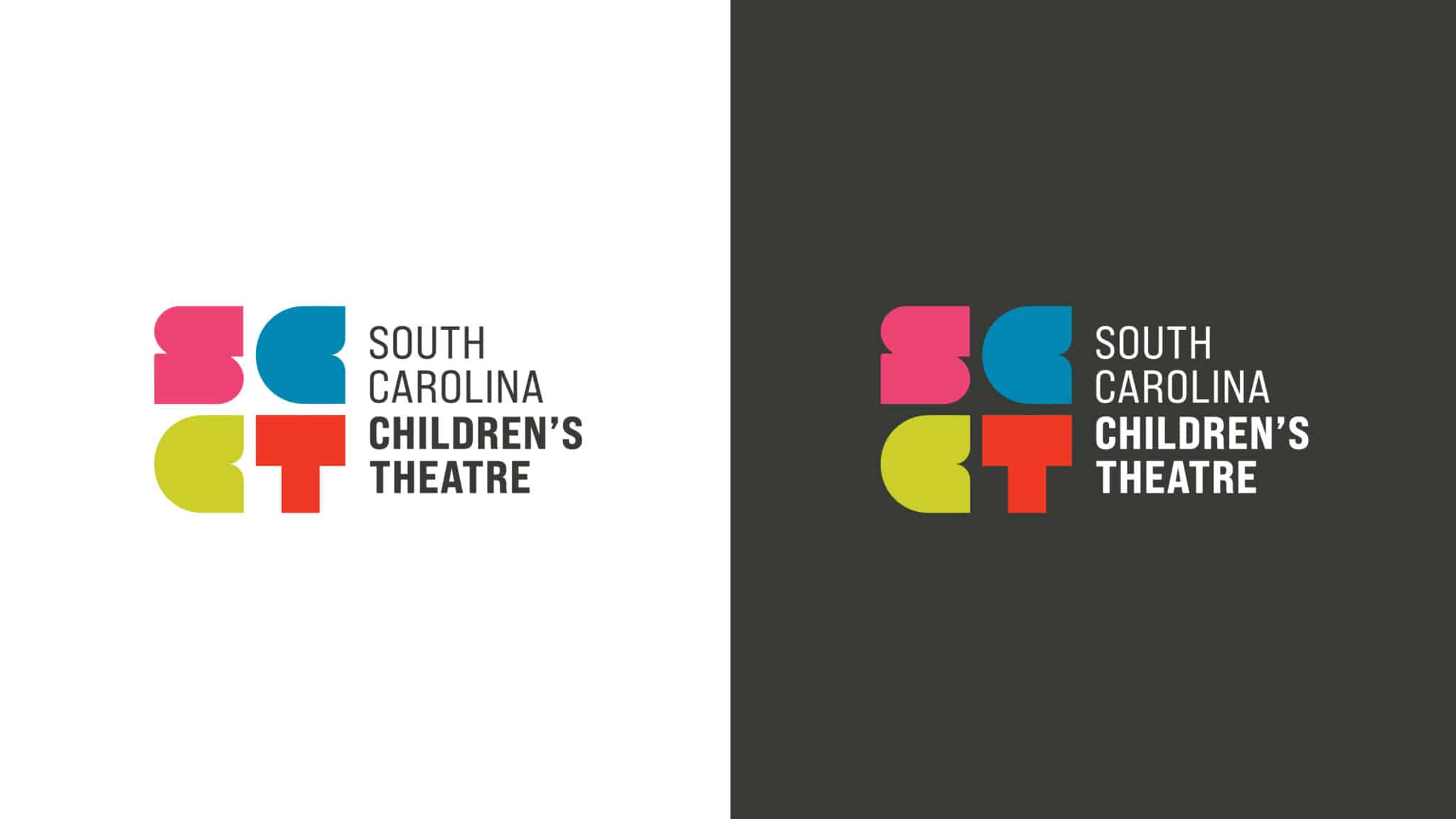
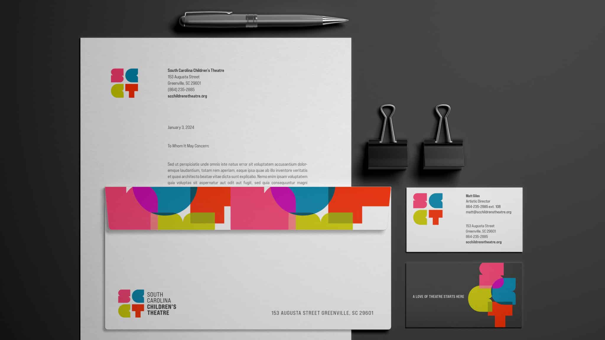
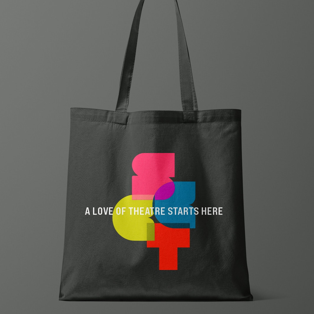
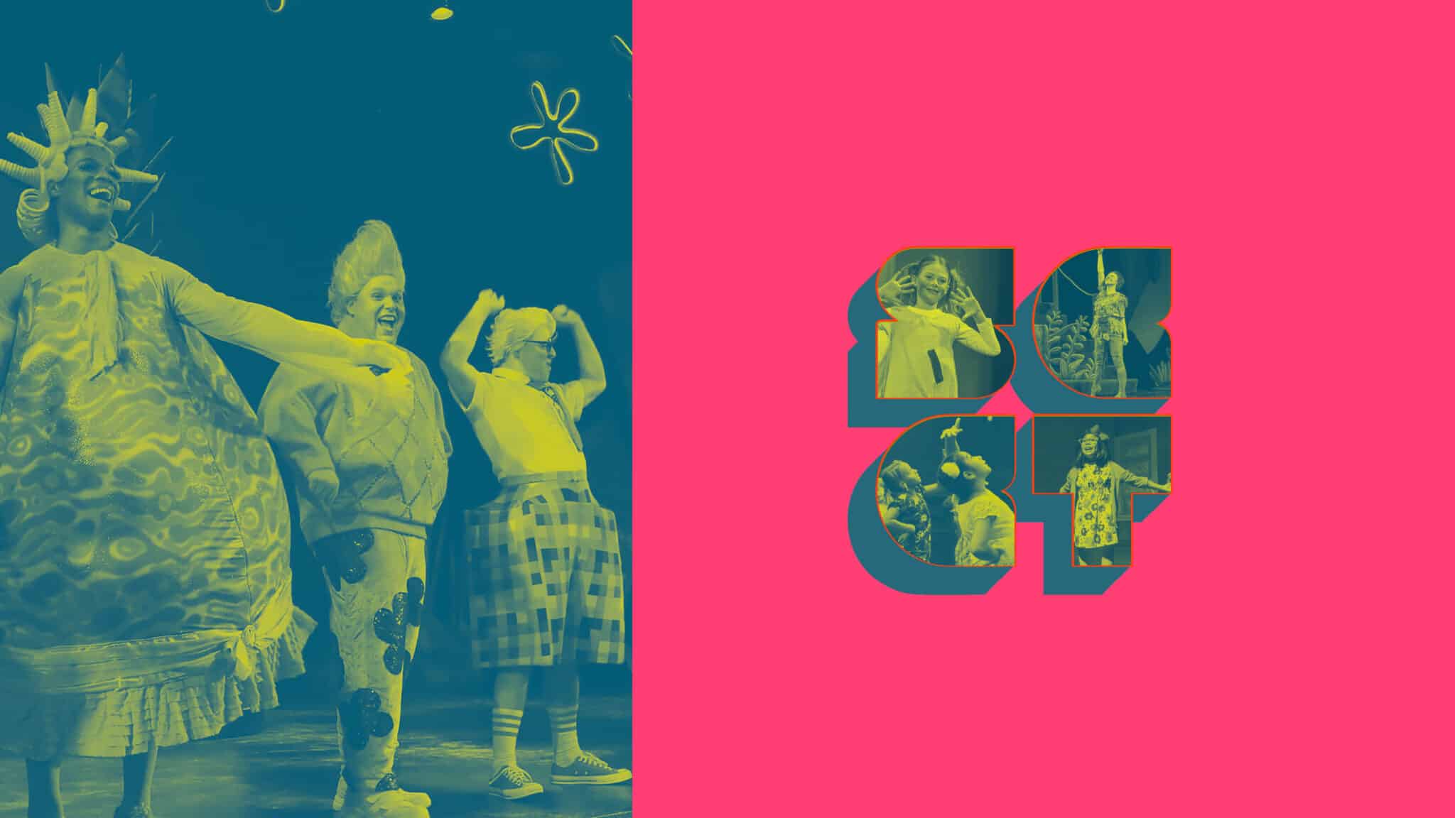
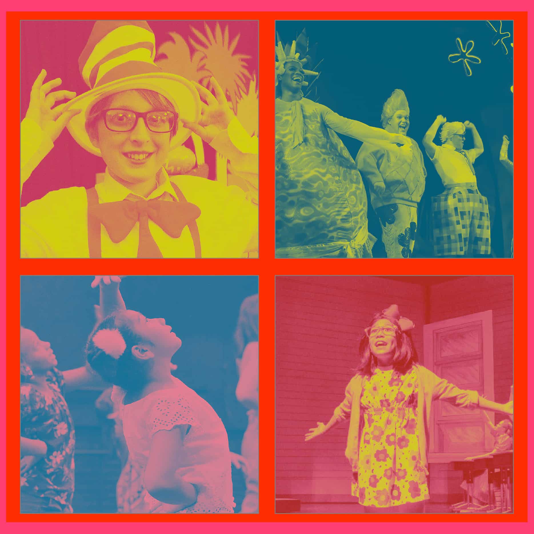
This logo translates SCCT into colorful graphical shapes to represent the program’s unique, lively, and diverse changemakers. And instead of conjuring one child star in the spotlight, we curated a color palette inspired by the translucent films on all the stage lights – a palette that can be used interchangeably, overlapped on photography as image filters, dialed up or down, etc.
What also makes the logo so versatile is that the graphic shapes can alternate through different colors in the palette, plus overlap to represent the transformational theatre experience when everyone – not just stars – come together to create magic.
“FUEL created a flexible design system and visual language full of personality, imagination, and joy to empower the SCCT marketing team and inspire SCCT’s audience.”
— Mary Church Cornette, Head of Creative | FUEL
Now go experience what it means for SCCT to “Make the magical powerful” for the whole Greenvillle theatre community! Buy tickets now!
FUEL understood our vision for the brand immediately, and even helped us strategize our messaging, all while bringing the brand to life. The new branding is so us. It somehow reflects all of the things we talked about, down to the tiniest details. But most importantly it reflects our community, our mission for that community, and a lot of fun we intend to have on our way to achieving our vision for South Carolina Children’s Theatre. We couldn’t be more happy about the SCCT team’s feedback, and how it’s being received from the wider community.
— Matt Giles, Artistic Director | South Carolina Children’s Theatre
Let’s ignite your brand’s full potential. Reach out to learn more using the form below.
All fields are required
Can’t wait to chat!
Courtney Beasley,
Executive Director, Marketing and Growth Strategy
Contact / Press Inquiries
Our experts are on tap to talk all things marketing strategy and building a brand that ignites demand. Reach out using this form to contact our team for press inquiries.
All fields are required
Can’t wait to chat!
Meredith Kinsey,
President and COO
Contact / General Inquiries
Can’t find what you’re looking for? Use this form to reach out to our team for help.