Refreshing a brand to mark milestones and bring new energy to a regional bank.
Overview
A Big Birthday Brand Refresh
Southern First, a relationship-first bank in the Southeast, was looking for a brand refresh for its 20th anniversary and the opening of its new corporate headquarters.
Banking is a highly competitive industry and solid brand differentiation and positioning is imperative. When you get down to it, most banks offer a fairly similar suite of products. Southern First’s 20th anniversary was a perfect opportunity to reground themselves in their brand essentials and refresh how they show up in their markets.
Logo Before
Logo After
The Strategy
Understanding Customers Builds Stronger Brands
Fully understanding the relationship between Southern First and its customers equipped the creative team with the information needed to deliver the best results. We invested the time to understand the customer, the bankers, and tellers and identified unique opportunities in the customer experience. This provided rich insights that inspired an impactful direction for the new branding.
Research
We started by immersing ourselves in the banking industry’s customer experience and product trends and reviewed Southern First’s business lines. Our team conducted key internal stakeholder interviews to gather perspectives across the organization as they related to the mission and vision, important differentiators, key attributes, and branding opportunities.
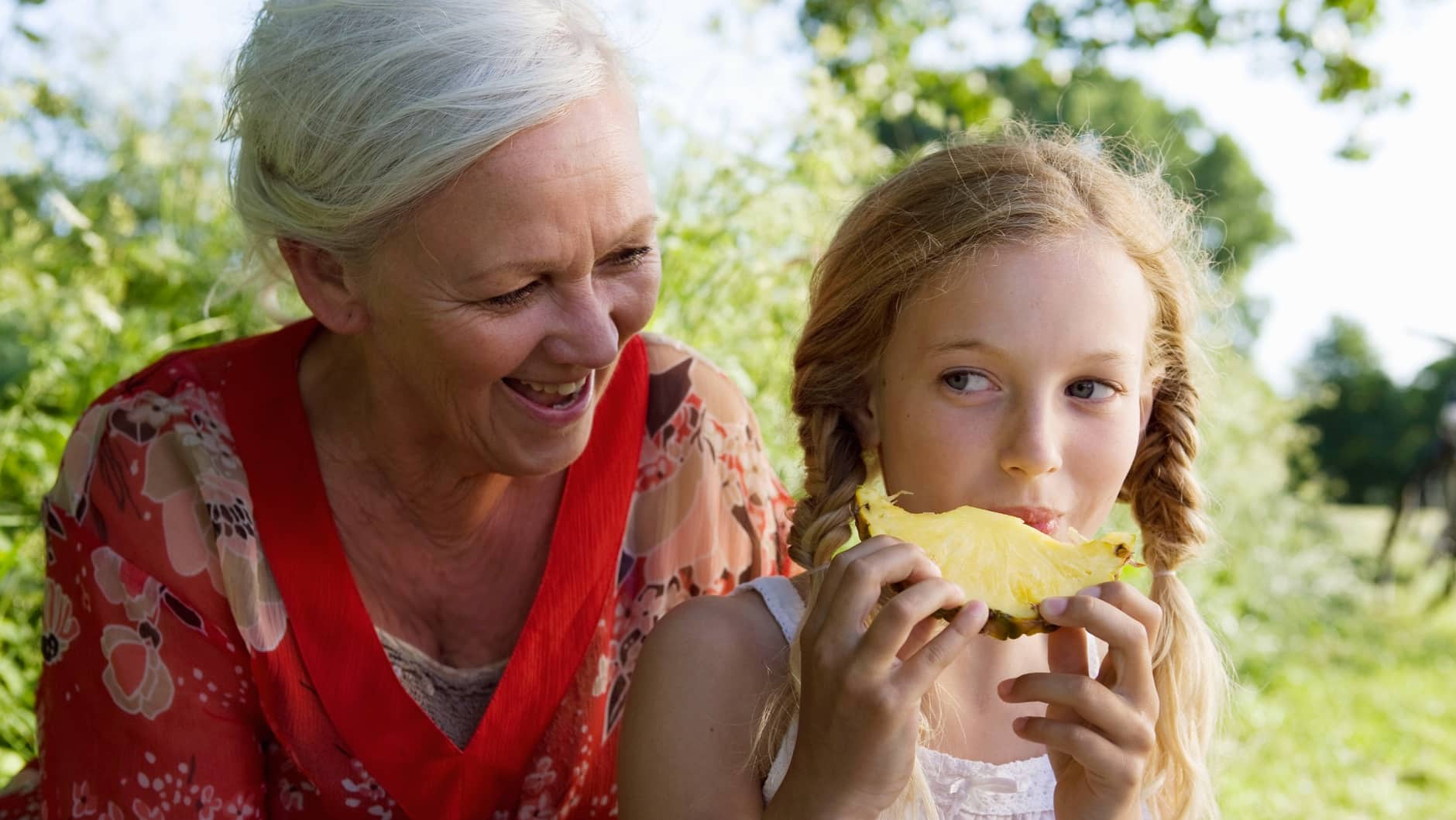
We uncovered that there was a real affinity and brand connection with the pineapple symbol. Customer’s attributed meaning behind the Southern First pineapple in the old logo – a symbol for southern hospitality and a core part of Southern First’s branding (it’s often referred to as “The Pineapple Bank.” So, we determined early that we would lean into this brand connection, and where the brand evolution would go, the pineapple would lead the way.
Competitive Analysis
We conducted competitive research to understand how other regional banks were positioning themselves with their messaging, branding, tone, and voice. We also drew inspiration from other successful national and international banks to identify additional strategic approaches and opportunities for Southern First.
Personas
Part of our brand strategy included persona development. We were able to focus tightly on our audiences’ needs when we visualized a specific “somebody” rather than a generic “everybody.” We explored how each of their customer persona’s interpreted and received hospitality from their Southern First experience. The personas helped us bring customer data and behavior to life, enriching the user experience within the digital environment as we applied the new messaging and identity to Southern First’s updated website.
The Results
A Brand Identity that Reflects True Brand Essence
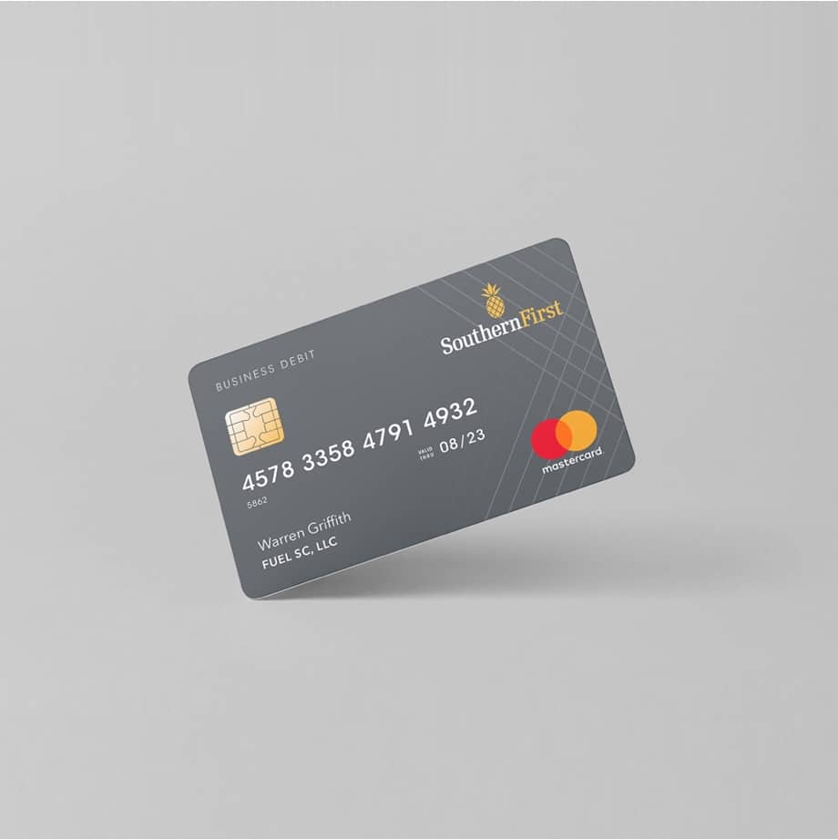
FUEL re-created the bank’s iconic pineapple symbol with geometric shapes and an approachable flower-like crown to blend the ideas of high-tech and high-touch service that Southern First is known for. The modern mark was paired with a traditional serif font to infuse warmth and trust—all elements that reflect Southern First’s dedication to hospitality, service, and convenient technology.
Southern First’s team and clients immediately embraced the new branding, which was quickly incorporated onto the bank’s website and other marketing materials.
We are all energized by our new logo and website! Both are modern and fresh while keeping the Southern First spirit and core intact, which is exactly what we were looking for. And they seem to really resonate with our clients and community members too.”
— Cal Hurst, EVP, Chief Banking Officer | Southern First Bank
Let’s ignite your brand’s full potential. Reach out to learn more using the form below.
All fields are required
Can’t wait to chat!
Courtney Beasley,
Executive Director, Marketing and Growth Strategy
Contact / Press Inquiries
Our experts are on tap to talk all things marketing strategy and building a brand that ignites demand. Reach out using this form to contact our team for press inquiries.
All fields are required
Can’t wait to chat!
Meredith Kinsey,
President and COO
Contact / General Inquiries
Can’t find what you’re looking for? Use this form to reach out to our team for help.