After acquiring Real Estate Scorecard, the new owners of the dated real estate directory envisioned a more accessible, consumer-forward brand to connect with potential homeowners.They needed a memorable brand that could extend beyond the website navigation and into the lives of consumers and developers.
Overview
Making Community Finder Feel like Home
Searching for communities to call home can be overwhelming. Community Finder was created to help users find and connect with their ideal community while also elevating the experience for developers by connecting them with potential homebuyers. As a mentor archetype, it was important for the Community Finder brand to exude its mission to share wisdom and support for buyers along their search.
Even though Real Estate Scorecard was an established brand, the rename brought the perception that Community Finder was a newcomer to this competitive landscape. It was critical that they not lose the equity within the company that had been around since 2006. After all, when searching for a new community, how do you know what information to believe? With authentic real reviews from actual homeowners, this platform combines overviews of the communities with honest feedback about what it is like to live there. It was critical that Community Finder be that same trusted source of information that Real Estate Scorecard had established.
The Strategy
Accessible + Modern
The name “Community Finder” clearly communicates the intent of the platform and the added benefit of reaching its audience via organic searches. While the literal name worked in our favor from a search perspective, the name itself could be perceived as generic. Thus, ensuring that this was a pleasant user experience and a memorable brand experience was critical.
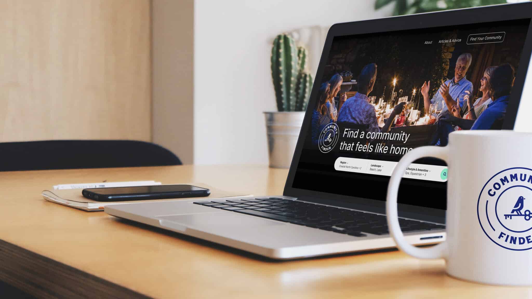
Based on our analytics and anecdotal experience, we knew our target demographic was 55+, so keeping those buyers in mind when creating a vibrant, modern brand was critical. We wanted the experience of using and engaging with Community Finder to be intuitive, accessible, and clean.
Competitve Analysis
After completing our competitive review, we saw that much of the competitive landscape felt similar or sterile visually. Though many brands appealed to their audiences with helpful and relevant information, many didn’t feel approachable or engaging. There were key opportunities to feel accessible while still being the go-to place to find a community. As we set forth the brand strategy, our path forward became clear.
Accessible and Friendly
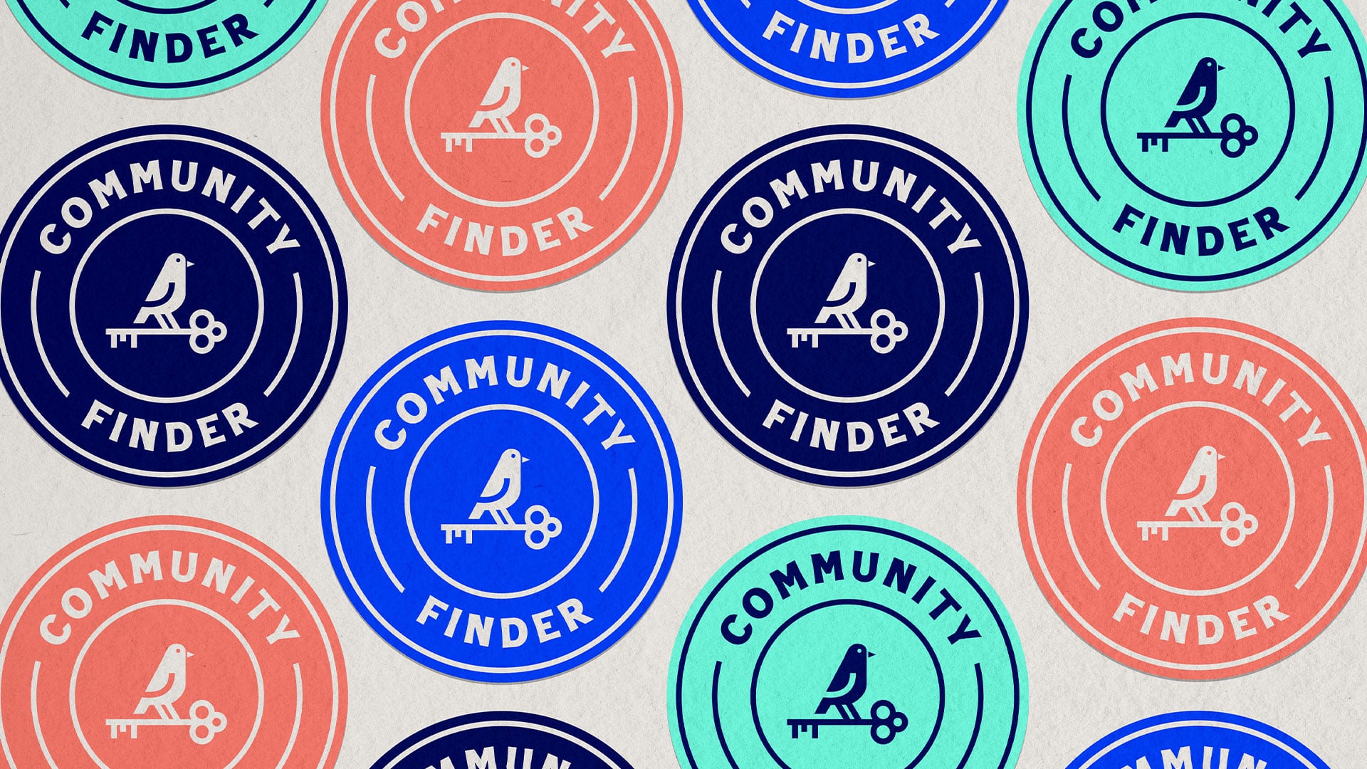
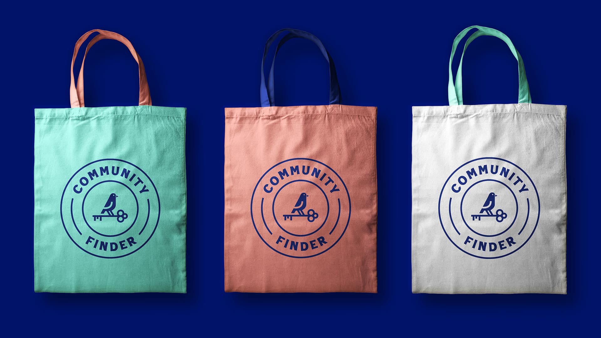
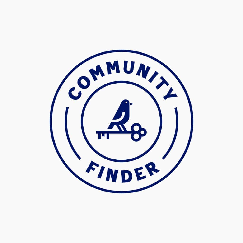
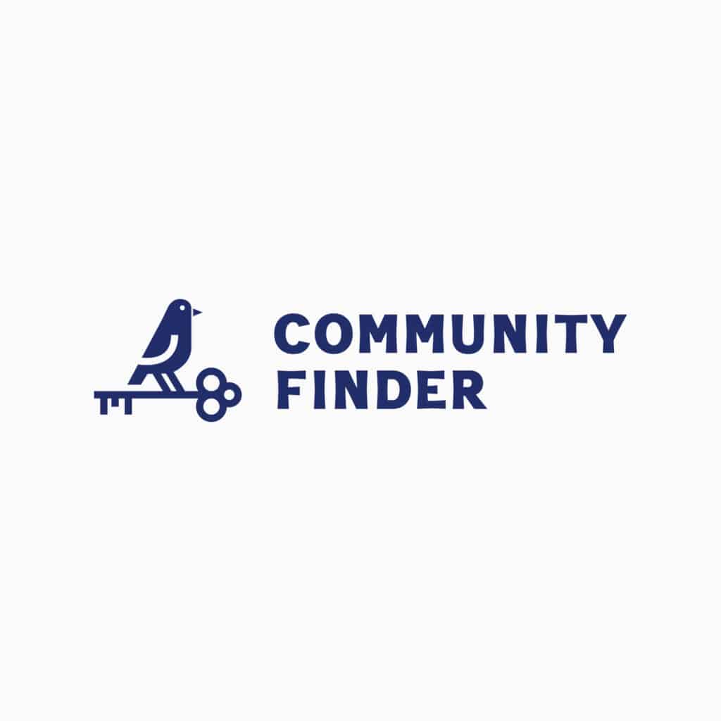
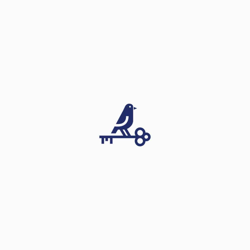
Community Finder aims to provide the best information in the most accessible way. Not only did they want their website to be enjoyable and effective, but they also sought to have their dedication to helping potential homebuyers reflected in the brand. In addition to a vibrant color palette that pairs well with the community-provided photography, we created the bird and key imagery to convey the idea that Community Finder is a “bird’s eye view” of communities. The main logo was then created as a badge-style logo to liken it to a stamp of approval.
By creating a look and feel that feels inviting, friendly, and trustworthy, we sought to elevate Community Finder above its competitors.
Unlike other real estate-based platforms, Community Finder leans into the bird and key imagery to create a warm “character” to represent the brand. This infused personality into the website, using the bird to share announcements and notifications.
Built-in Flexbility
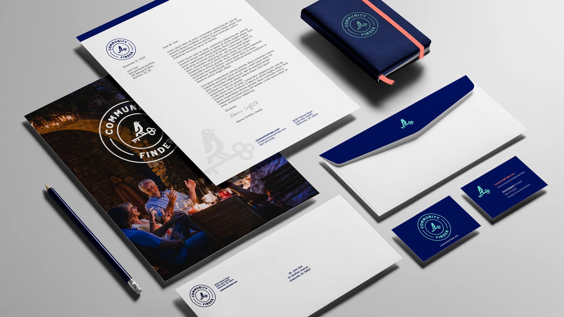
With Community Finder being a brand that primarily lives on a website, flexibility was critical to the development of the logo. The main logo uses a badge shape, which can be challenging to use in responsive web design, and holds meaning to the brand and the purpose behind the offering. Creating variations of the logo provided the flexibility needed while maintaining the integrity of the logo and brand across both print and digital mediums while using the bird & key mark as a consistent brand element.
Awards
AAF 2022 Gold Award – Logo Design
AAF 2022 Gold Award – Integrated Brand Identity Campaign
AAF 2022 Silver Award – Stationery Package
“We are thankful to the FUEL team for creating a sophisticated yet approachable new brand that really speaks to our archetype and company mission. In the competitive real estate market, it’s imperative that our brand help us stand out and resonate with our users”
Let’s ignite your brand’s full potential. Reach out to learn more using the form below.
All fields are required
Can’t wait to chat!
Courtney Beasley,
Executive Director, Marketing and Growth Strategy
Contact / Press Inquiries
Our experts are on tap to talk all things marketing strategy and building a brand that ignites demand. Reach out using this form to contact our team for press inquiries.
All fields are required
Can’t wait to chat!
Meredith Kinsey,
President and COO
Contact / General Inquiries
Can’t find what you’re looking for? Use this form to reach out to our team for help.